OOB
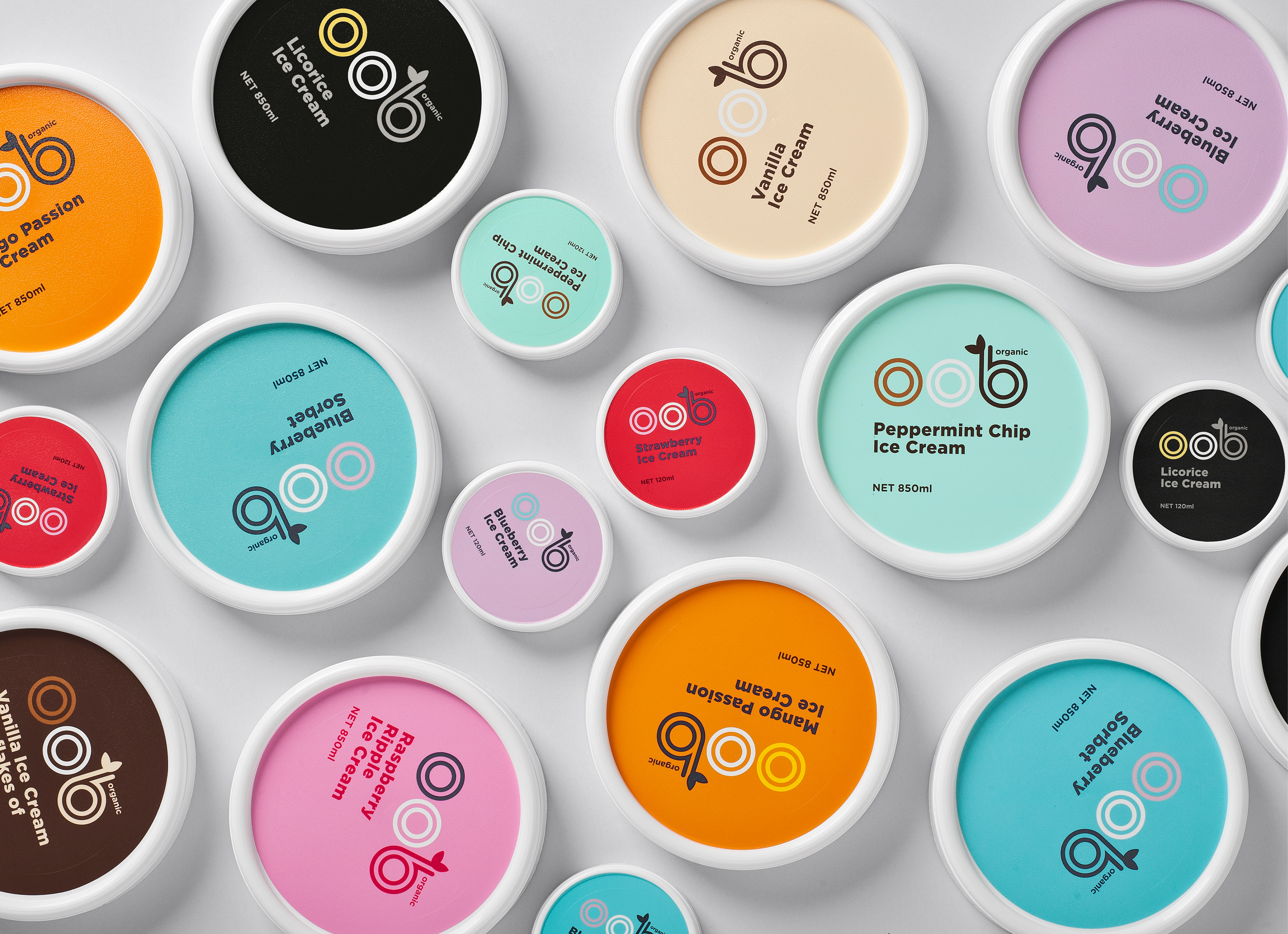
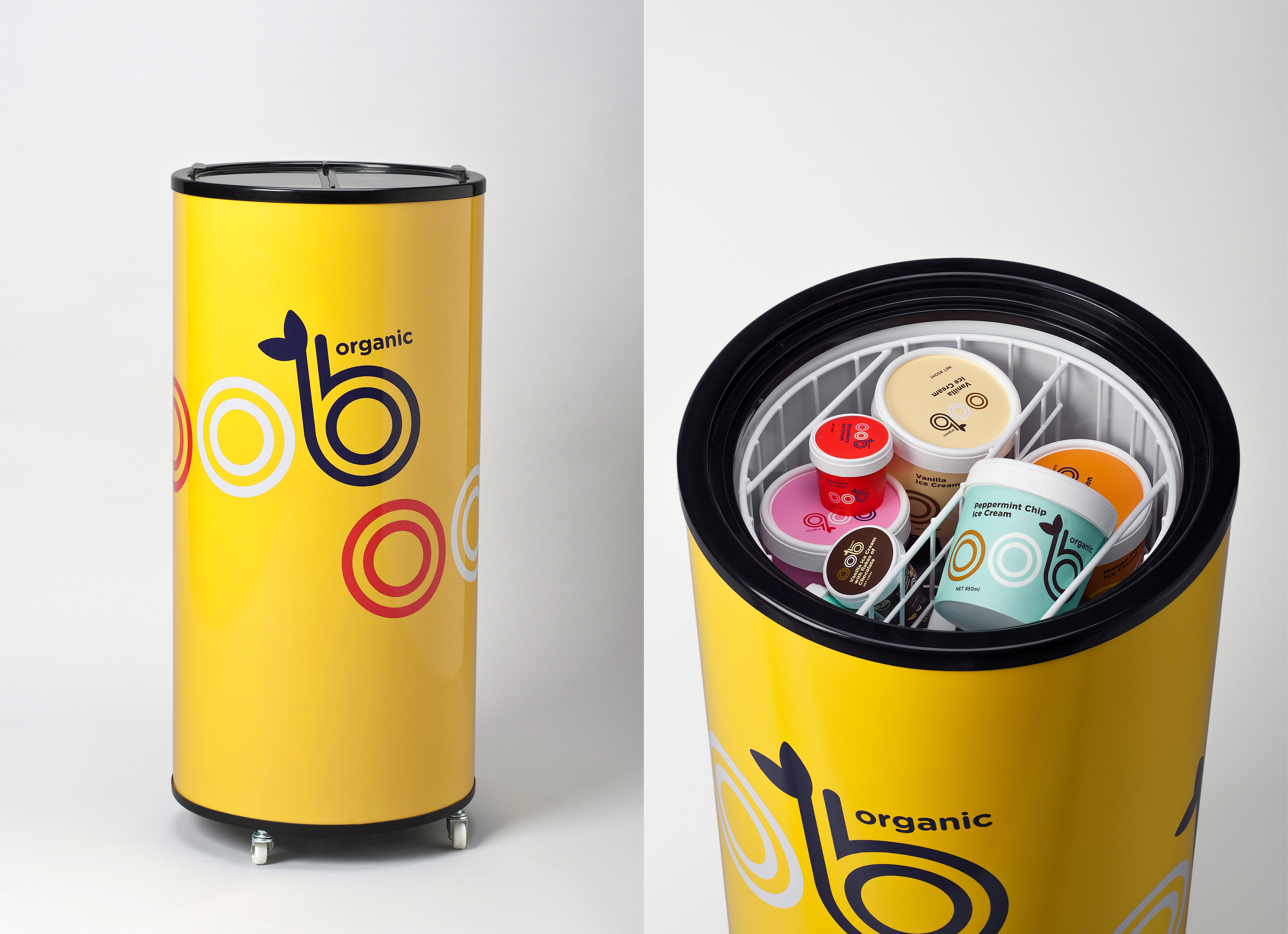
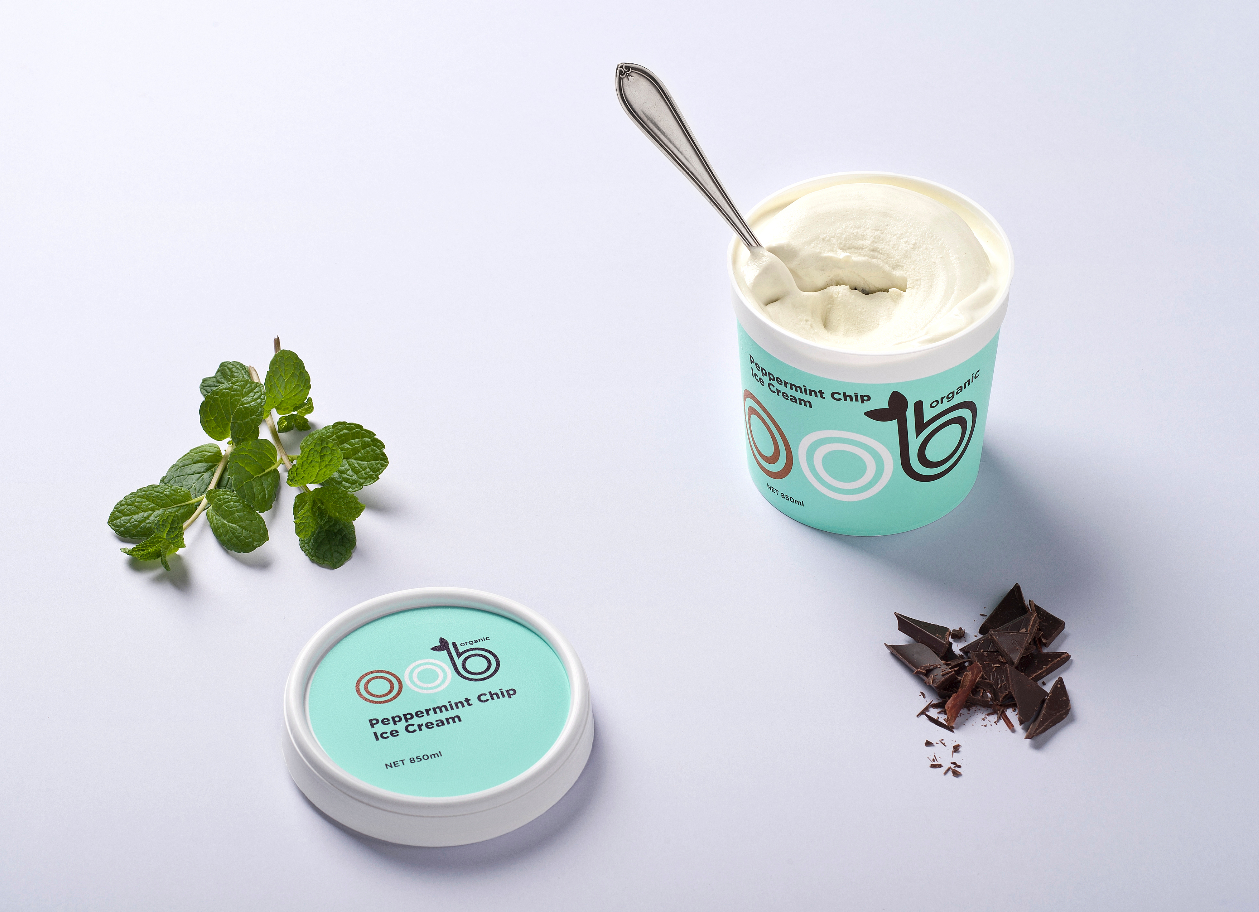
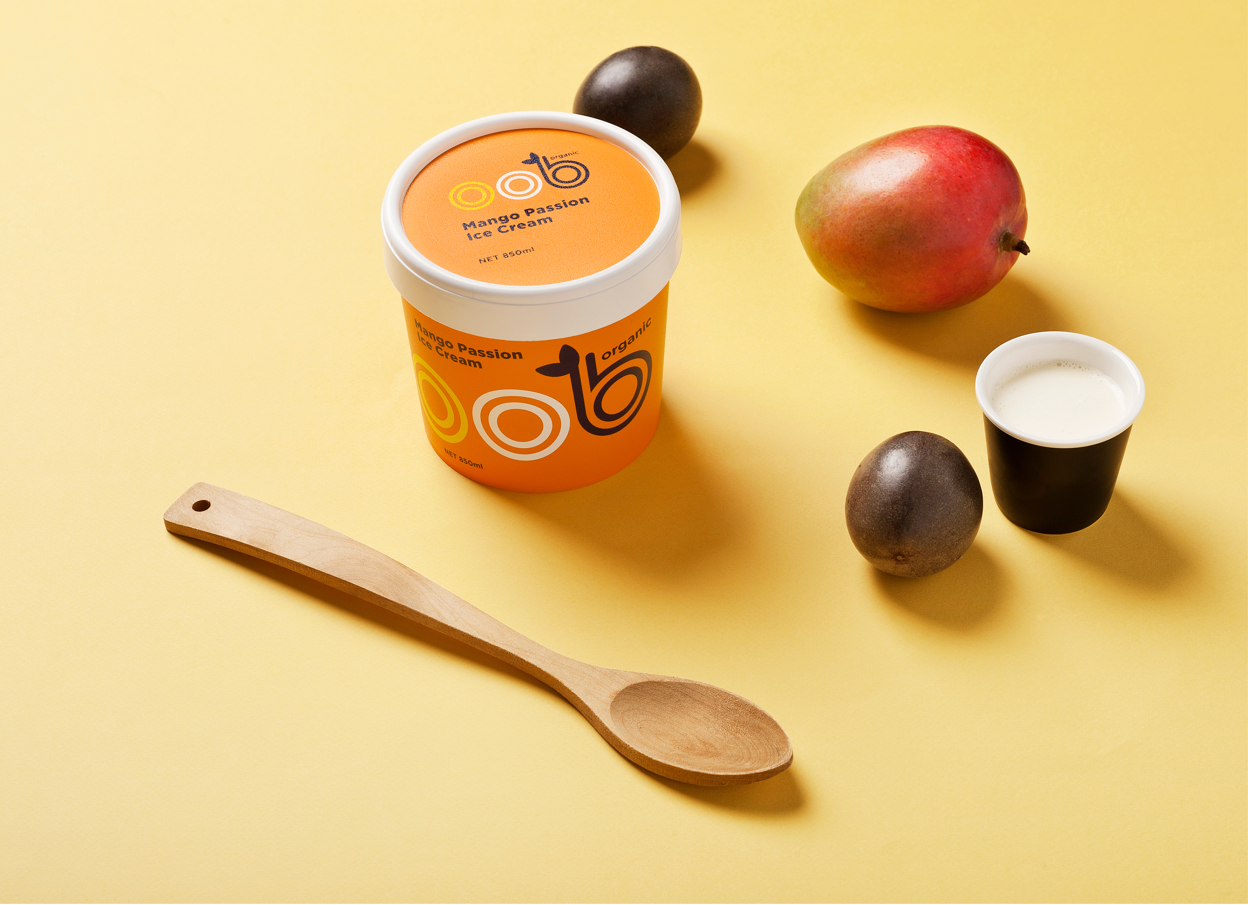
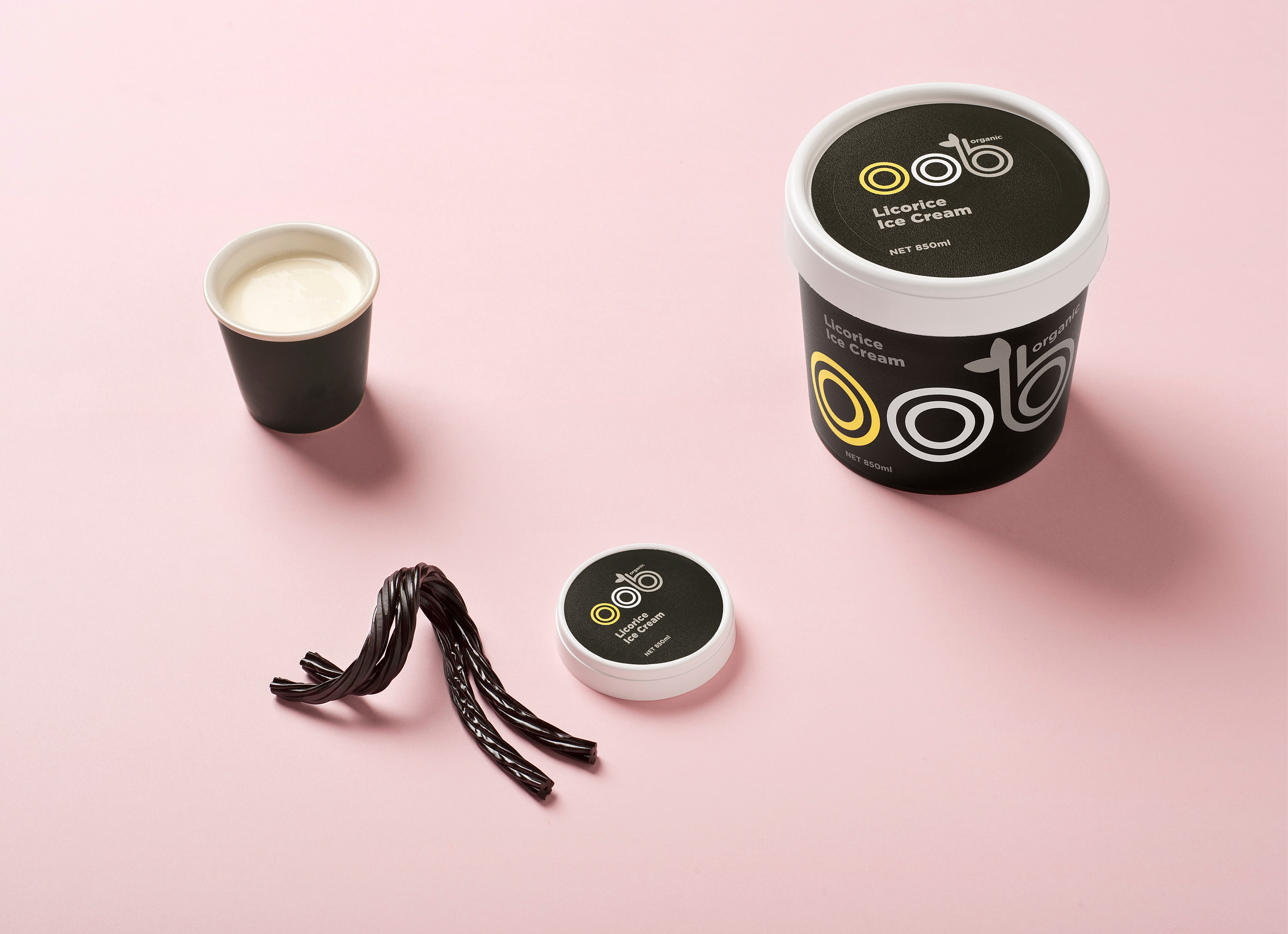
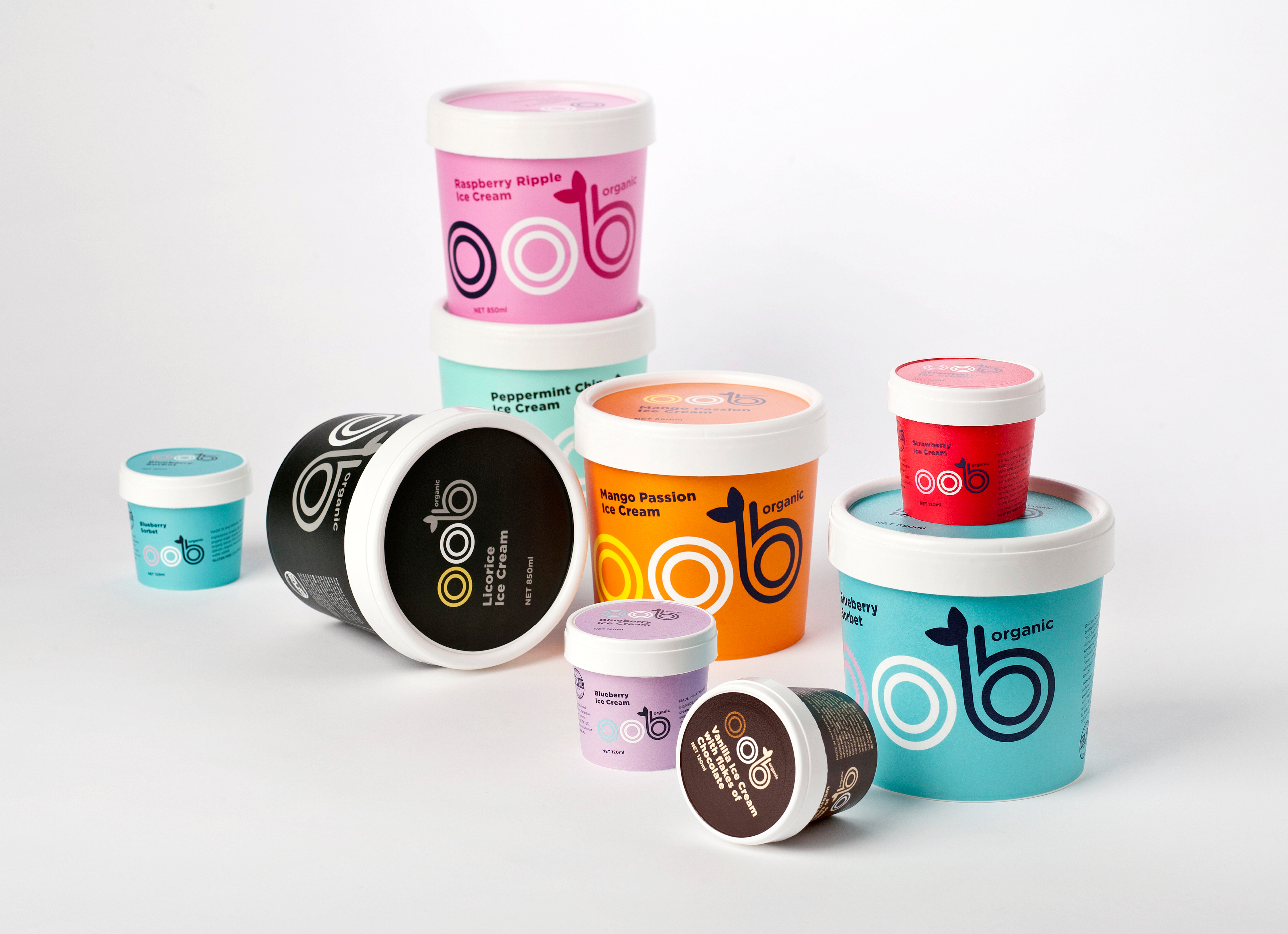
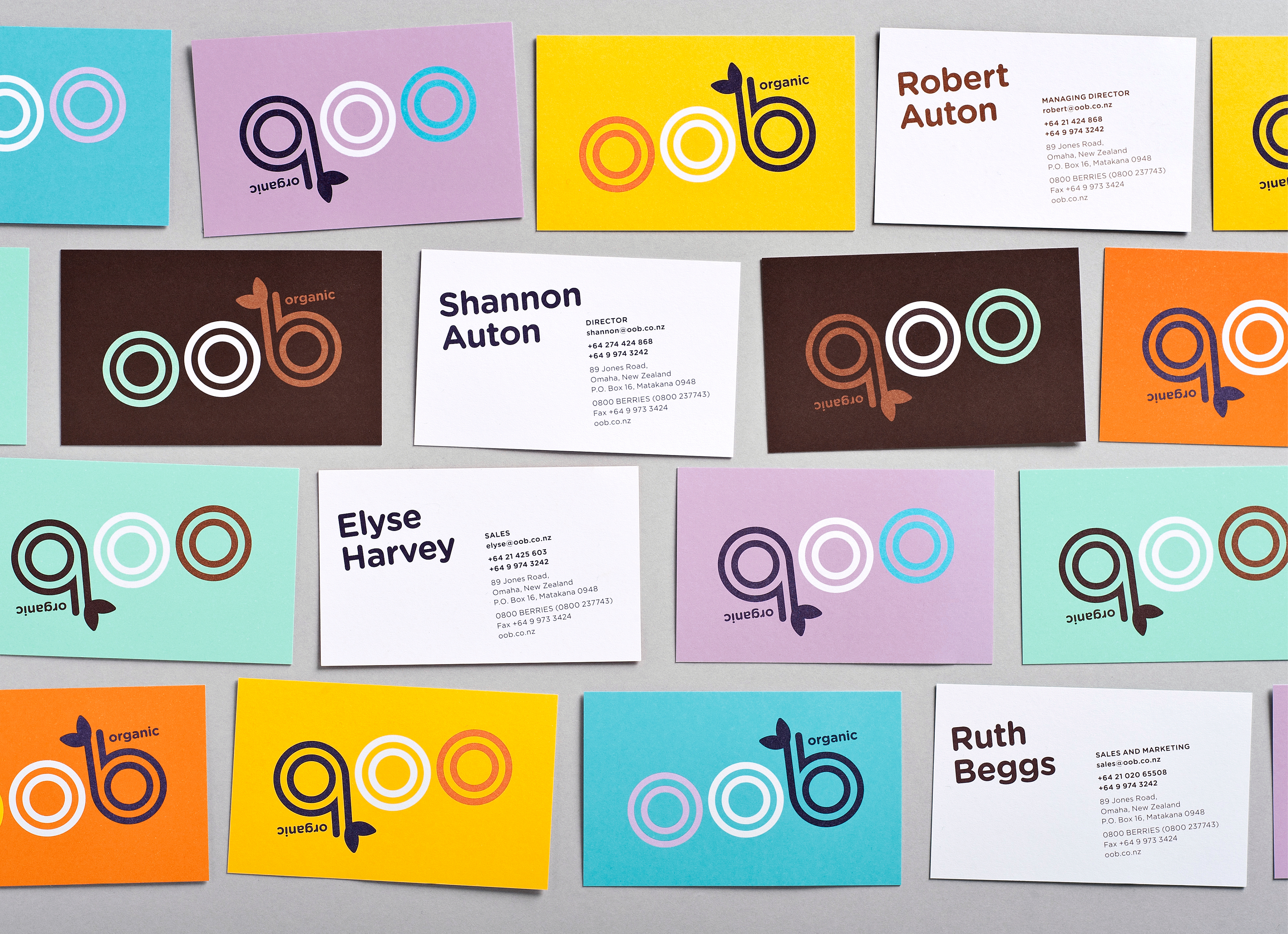
Fast-growing organic foods producer OOB was battling fierce competition in both the organic and general grocery categories. Inspired by their uncompromising spirit, we refocused their brand with the aim to cut through the clutter on shelf. At the core, the OOB brand is simple, honest and pure; no added flavours, no added preservatives, no added enhancements. Just the enjoyment of real cream, real fruit and real ingredients. We decided not to add much into the mix either; just the colours needed to tell our story of flavours. We worked up 3-colour combinations to create an undeniably nontraditional palette. And not processed colours either, they are pure, fresh spot colours. In colour, type and language OOB is simple, bold and playful—its fashion-aware personality creates desire to rival other producers in the market—organic or not.
Designed while working at Special Group.
