Skinsmiths
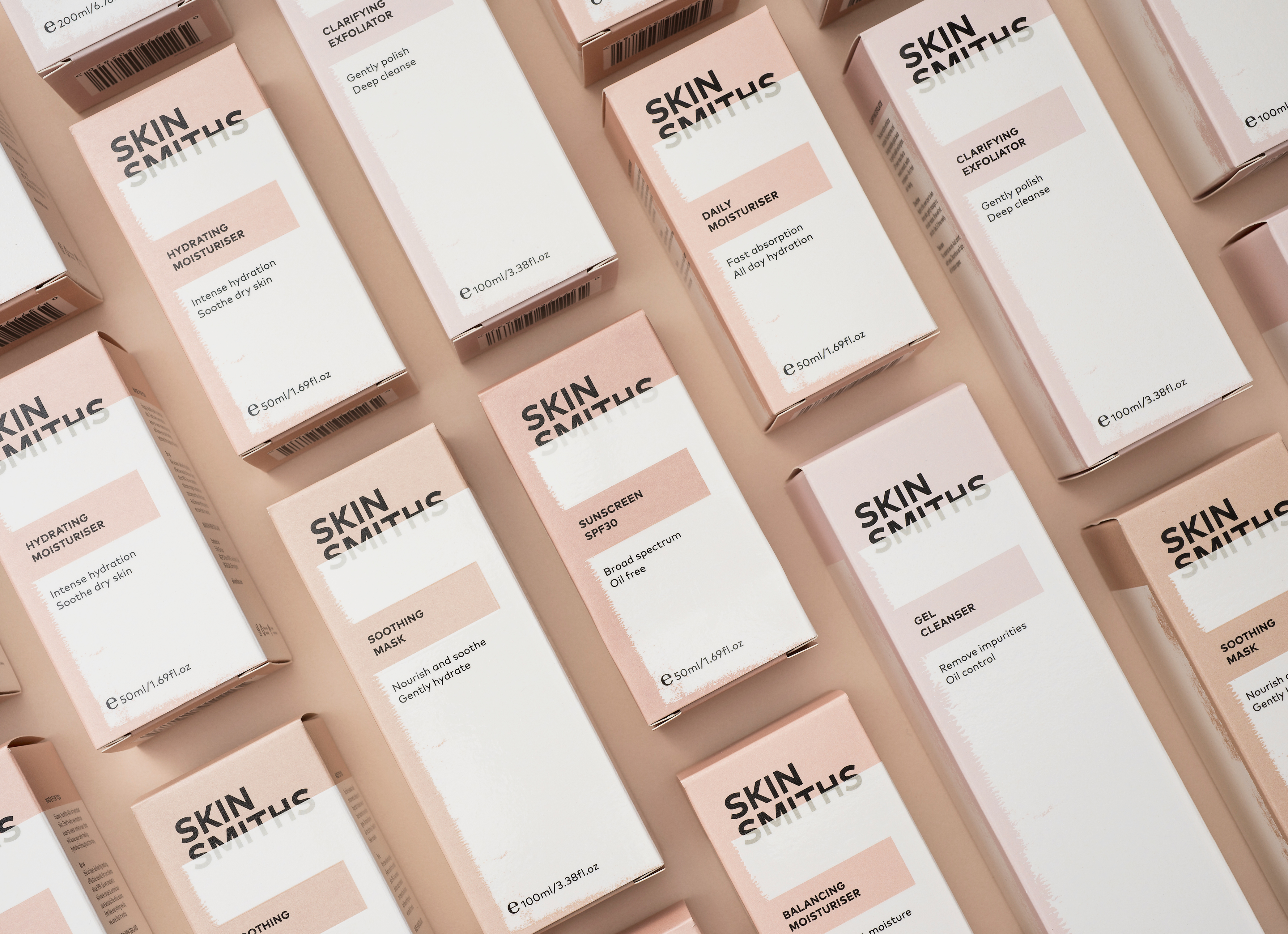
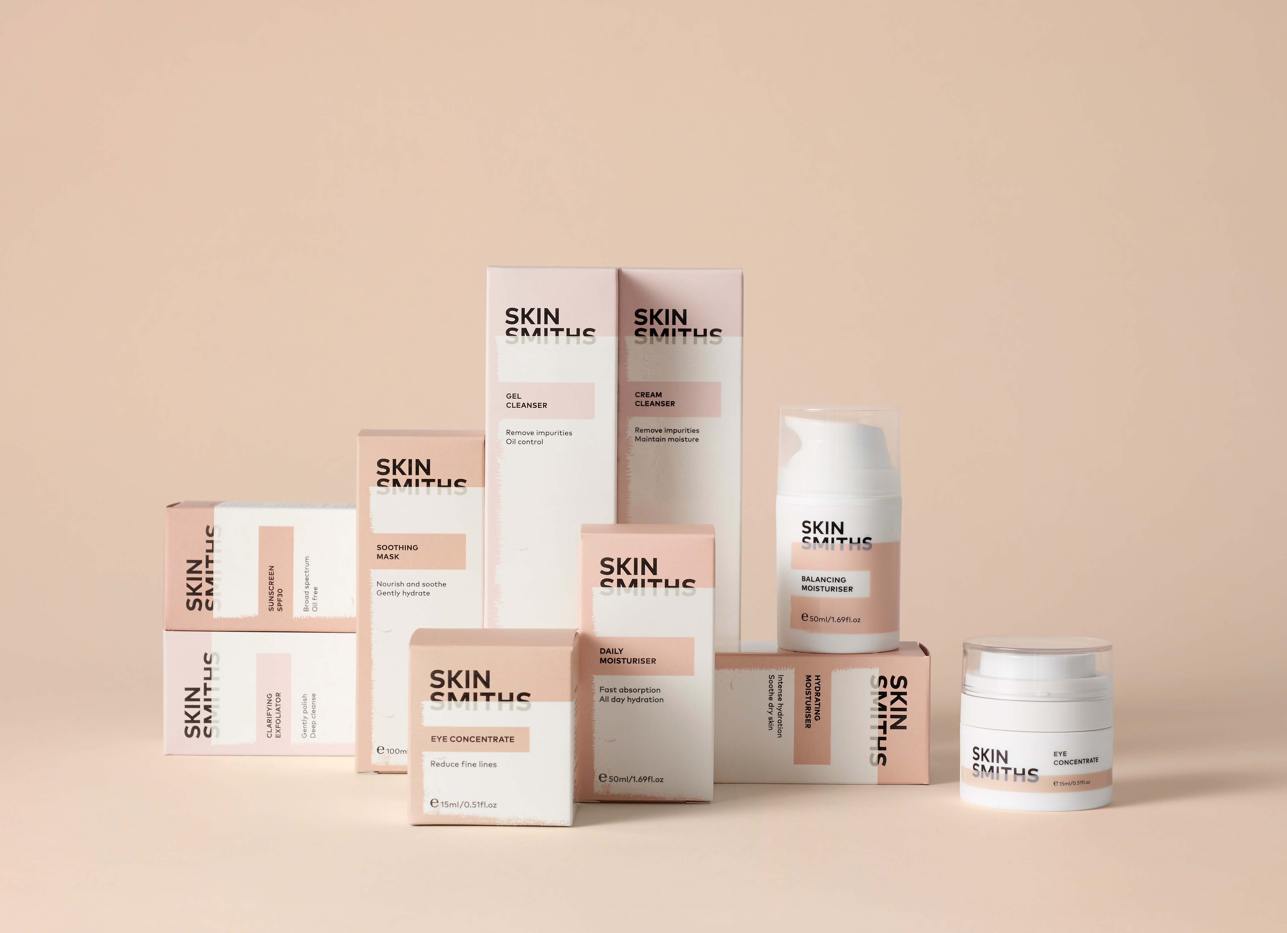
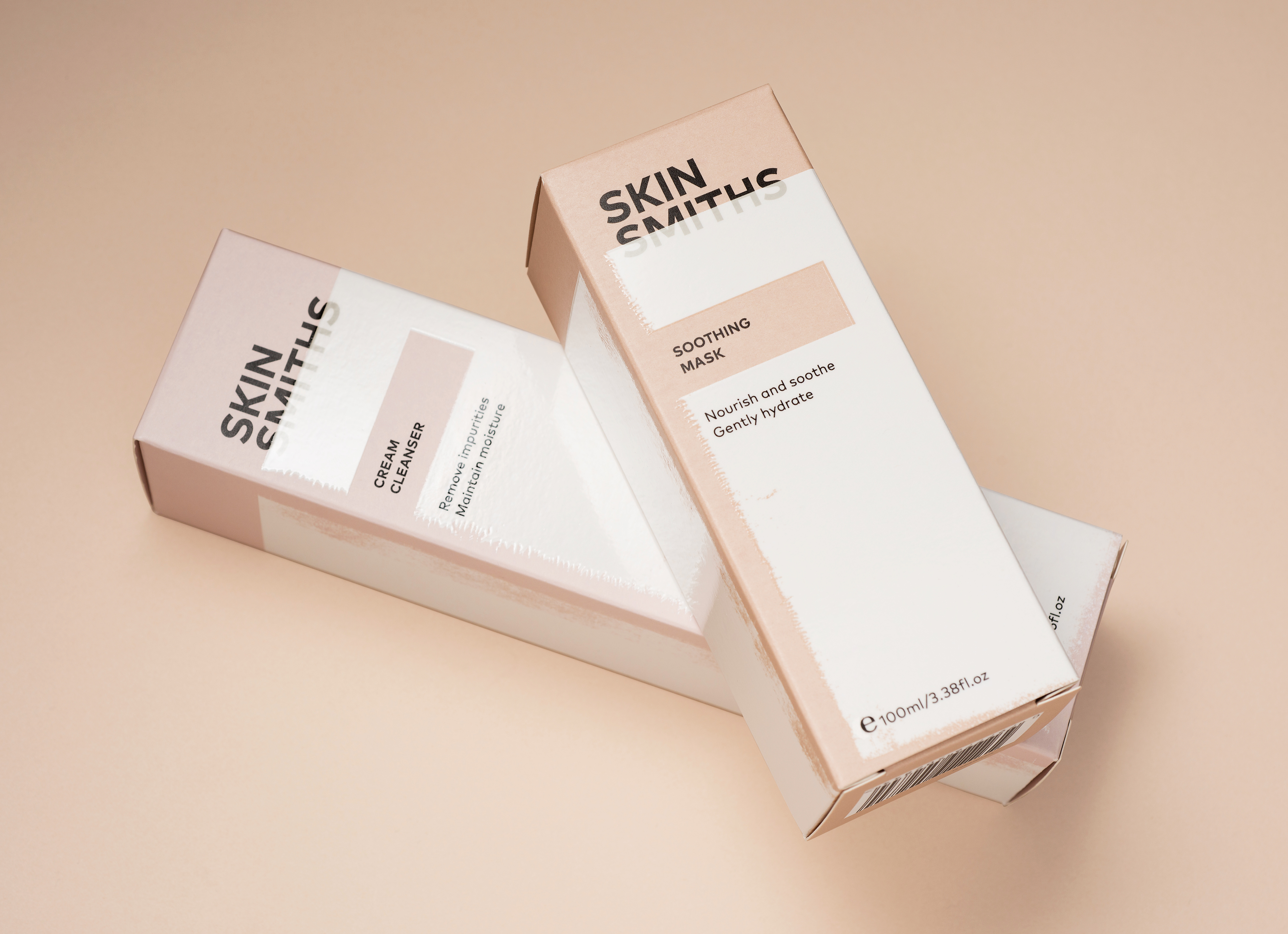
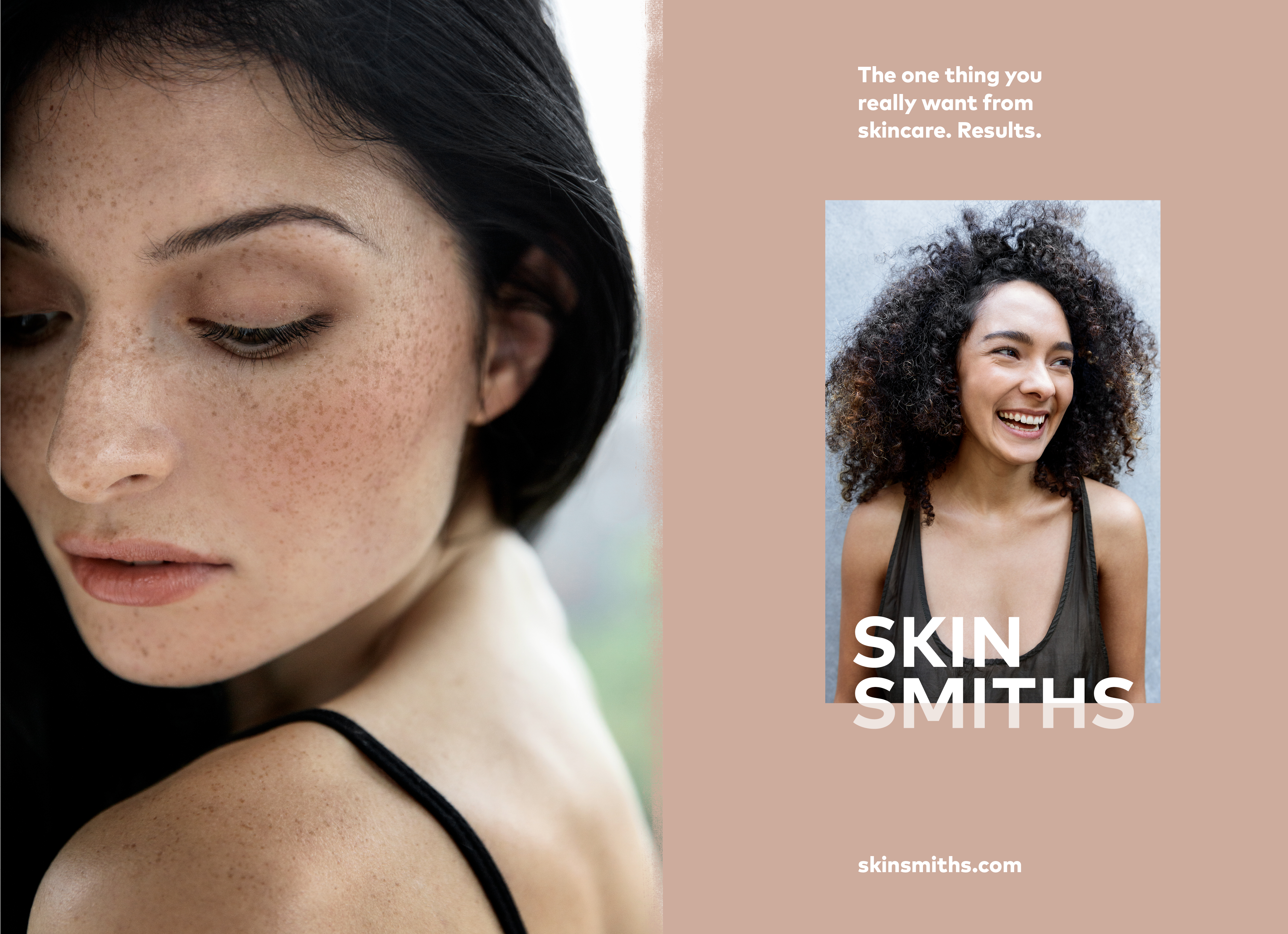
Skinsmiths have a strong relationship with their clientele, built on warmth, trust and results. Their mission was to extend this relationship by creating a product range that proven to protect, as well as looking and feeling good on. Our brief was to create an aspirational mass-market product with sophisticated, quality packaging that hints at lifestyle but whose key objective is efficacy — simply put, it works. A new-comer within a sea of very clinical, same-look, same-price competitors, and a very defined category visual language, Skinsmiths wanted to stand apart.
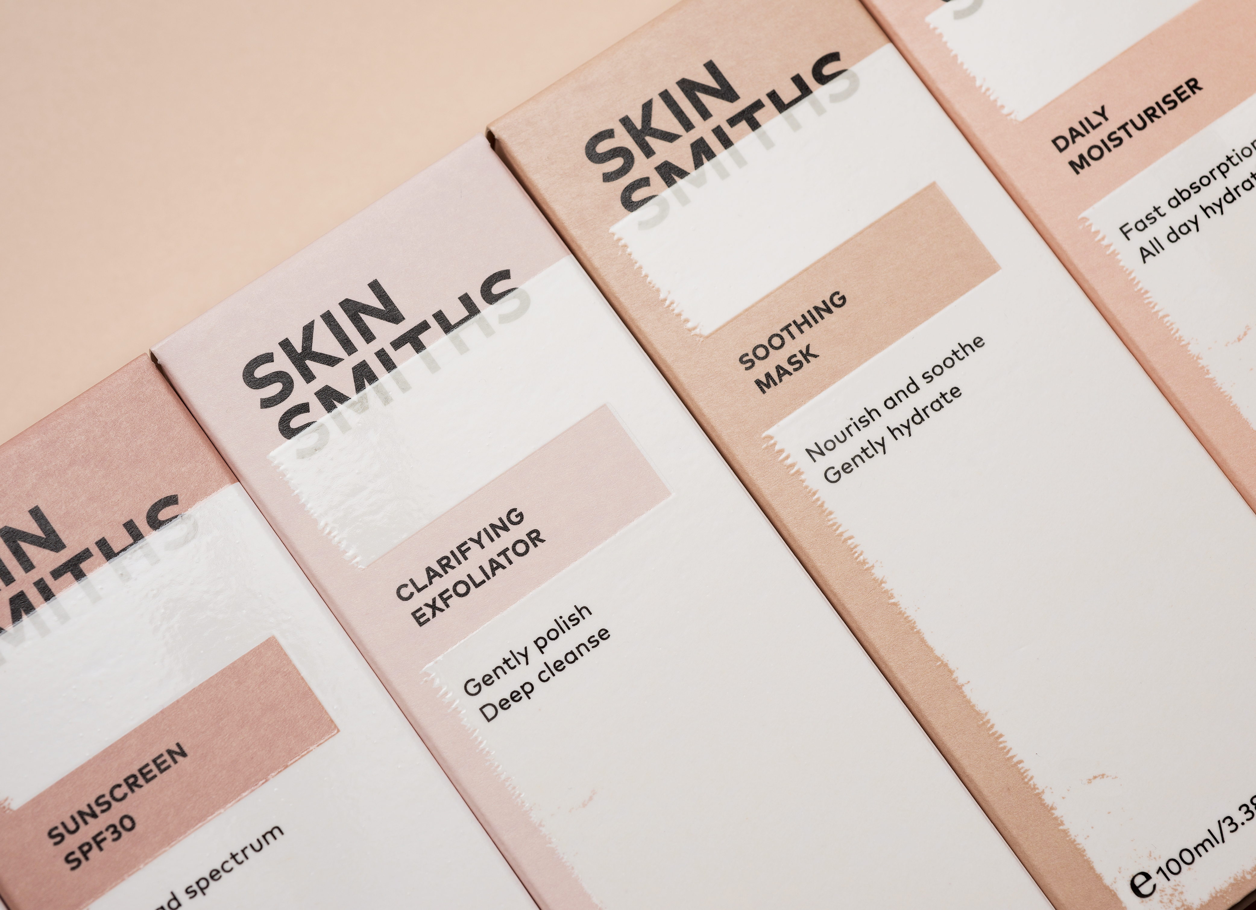
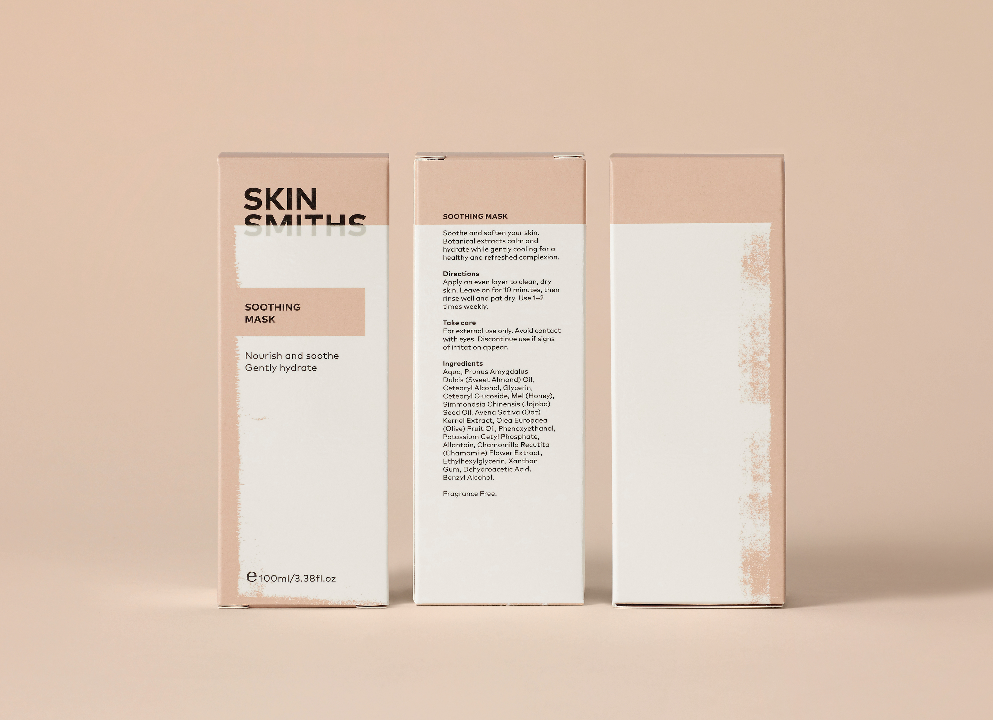
The material interaction between uncoated paper and print finish work as a succinct metaphor for the application of protective skincare products. We used black type as the bold foundation of the design, layered with a warm, skin-tone base on an uncoated board which is in turn over-printed with a gloss finish, texturally similar to the feeling of applying skin lotion. Through the absence of embellishment and the use of muted, warm skin tones, a well-established sense of clinical effectiveness is appropriately satisfied, within the context of skincare. The twist is revealed in the subtle detail up close in the interplay of finishes, an unusual impact, standing apart from clinical brands and lifestyle brands both.
Best Awards 2018: Finalist: Packaging.
