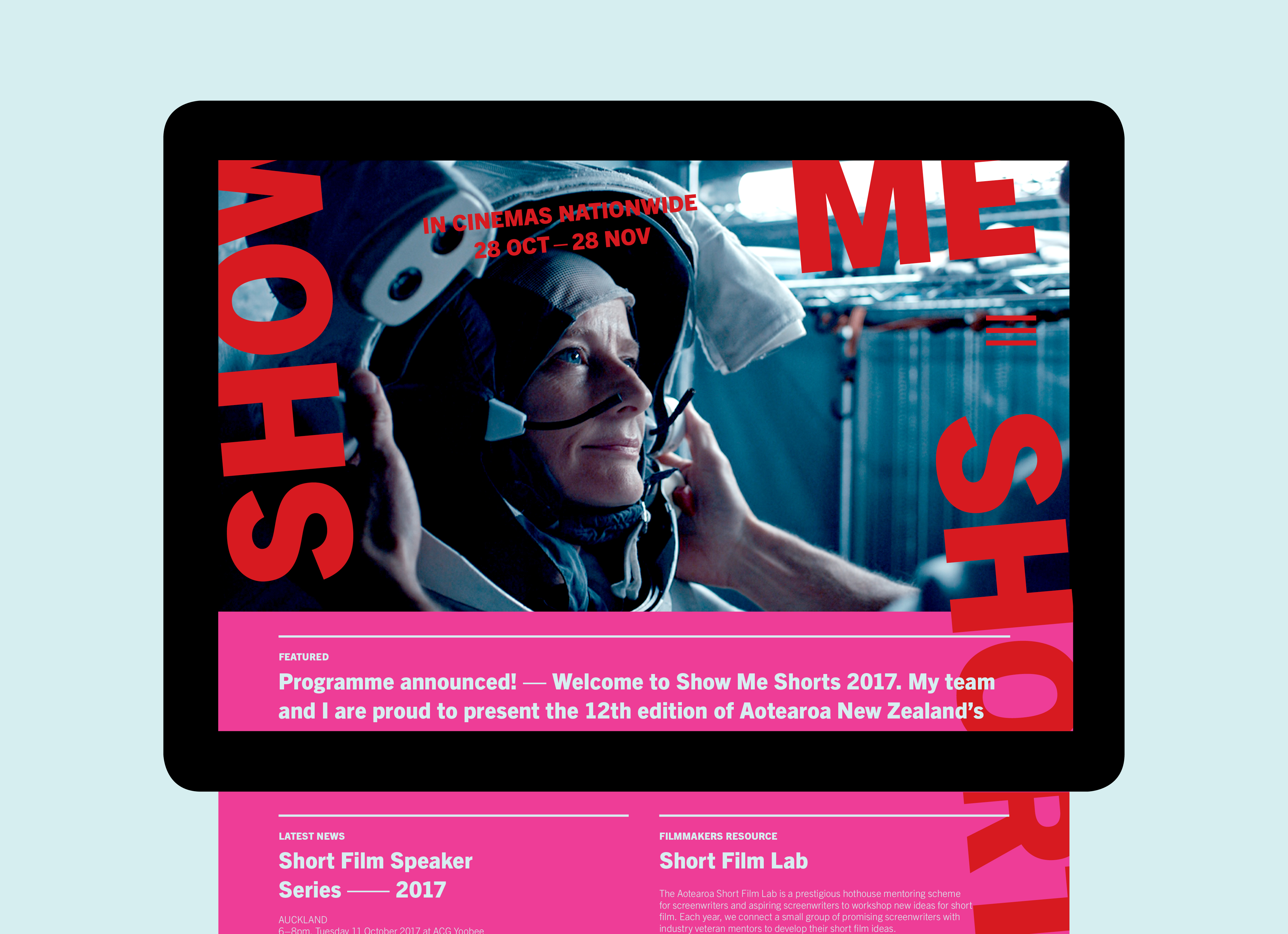
Show Me Shorts 2017
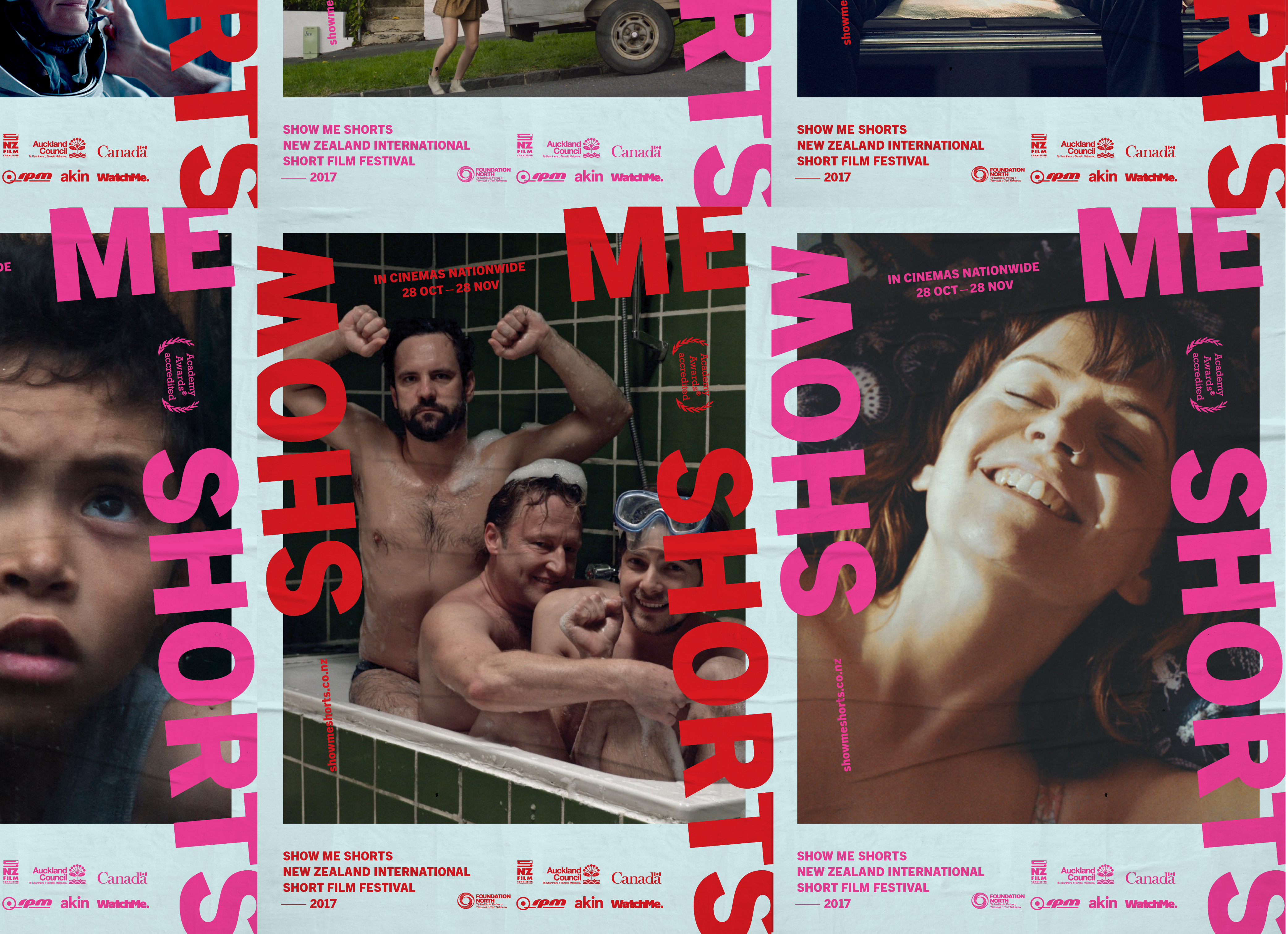
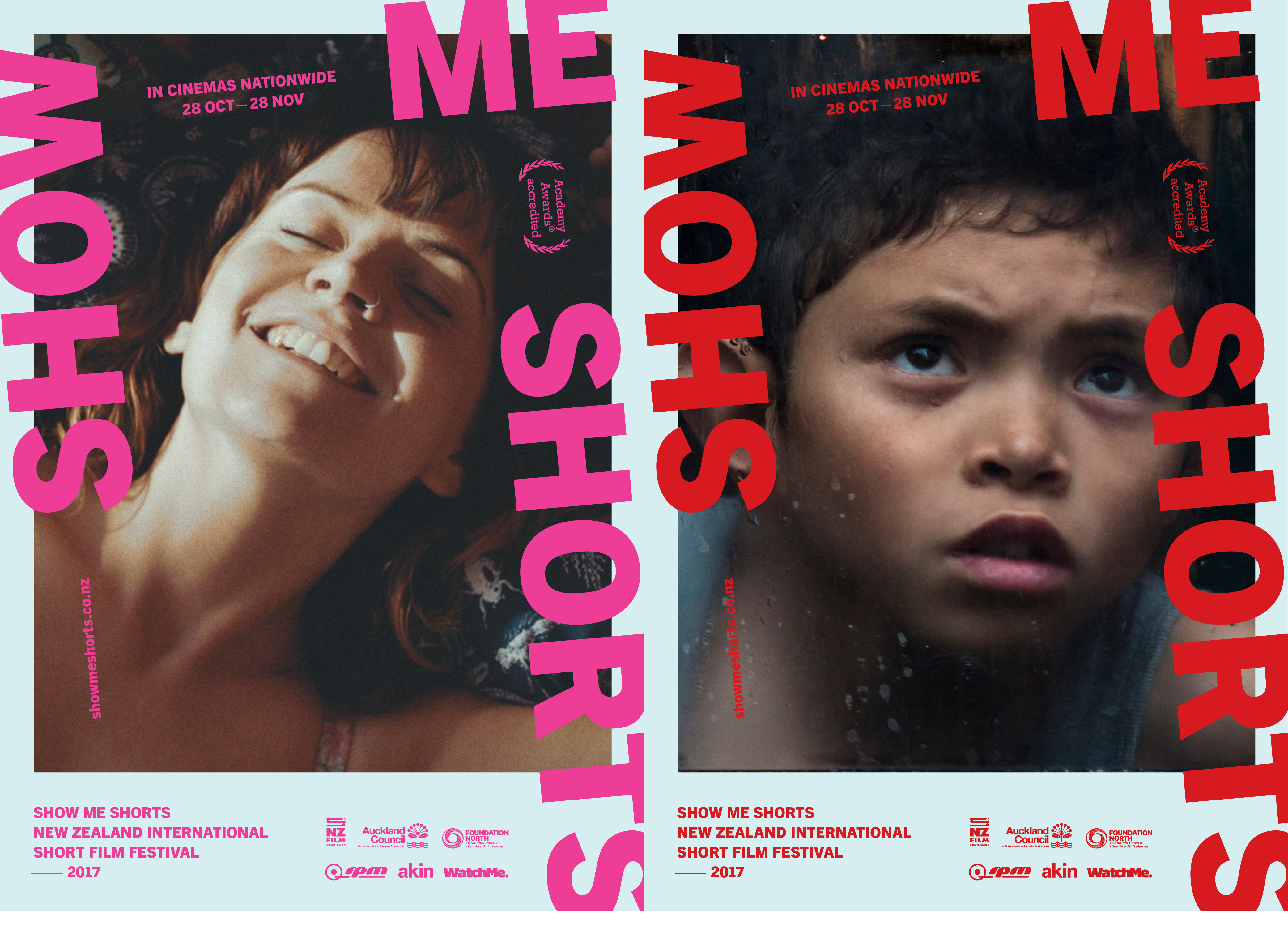
Since its inception, Show Me Shorts was known for their “bold, bright, punk aesthetic…a little bit edgy, rough and ready — with a strong independent voice”. With a get-stuff-done attitude, they were on a mission: 01) to announce the festival’s maturity and clarify their commitment to quality short filmmaking through a rebrand, launched as part of their 2017 campaign.
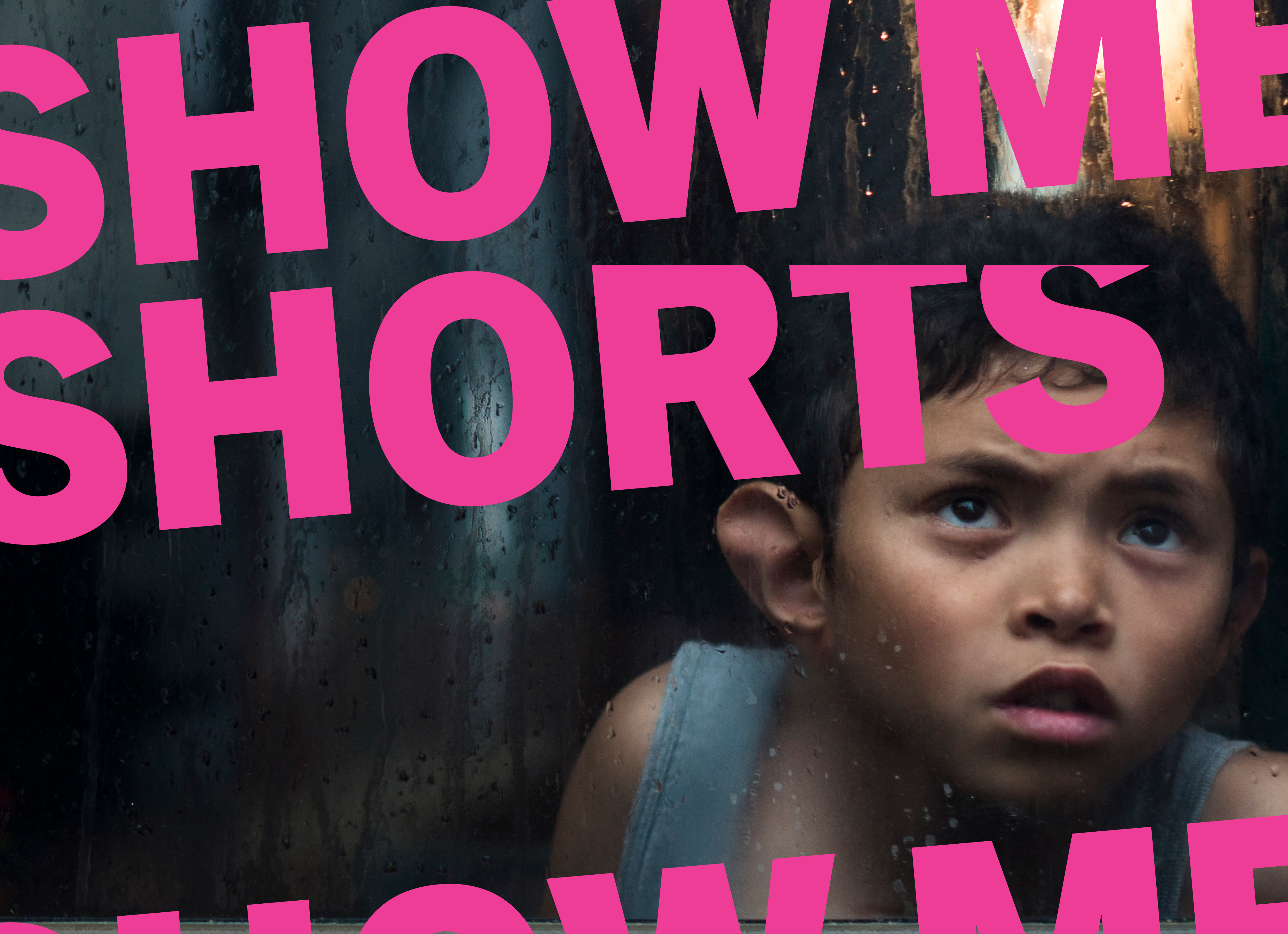
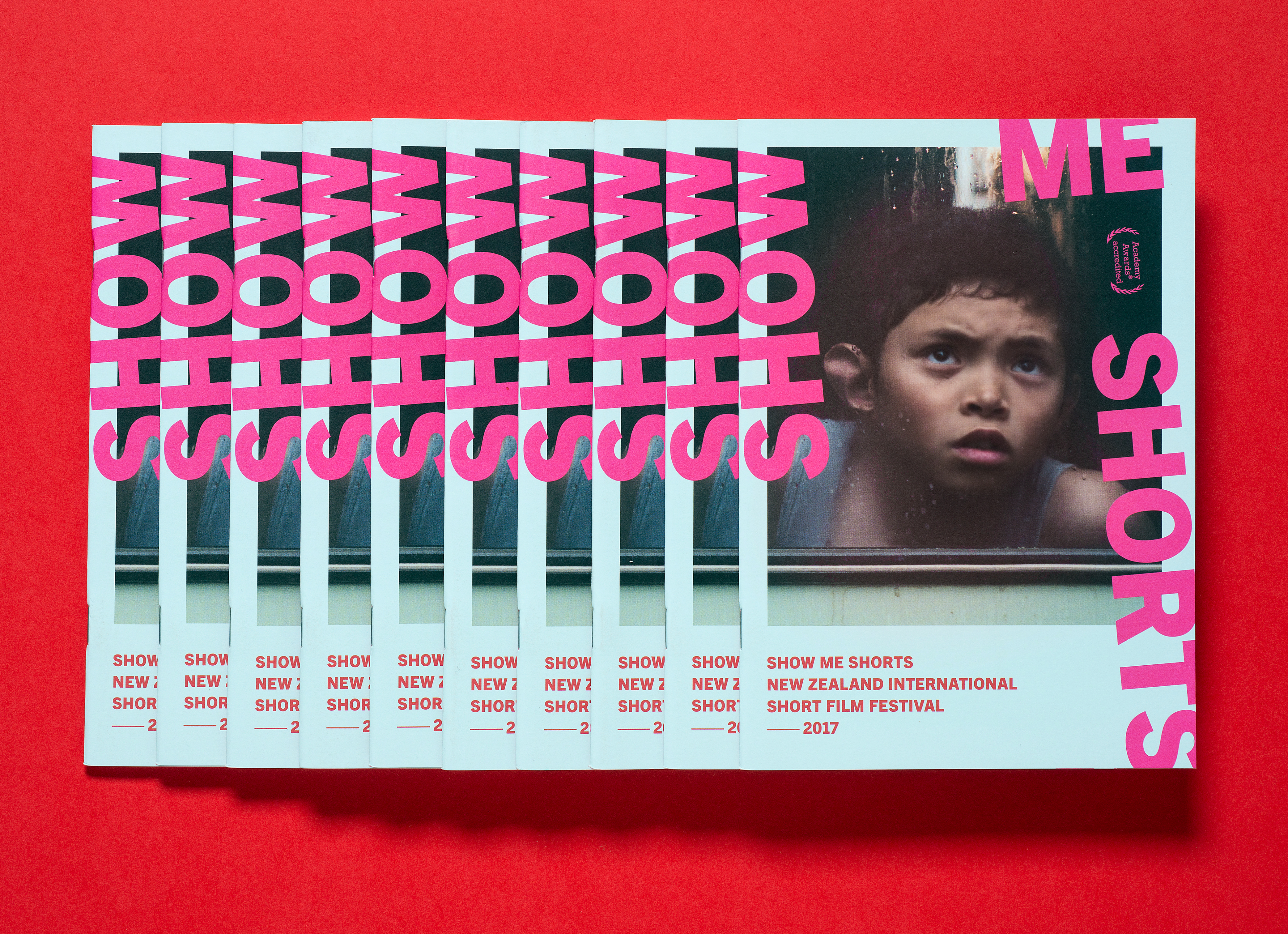
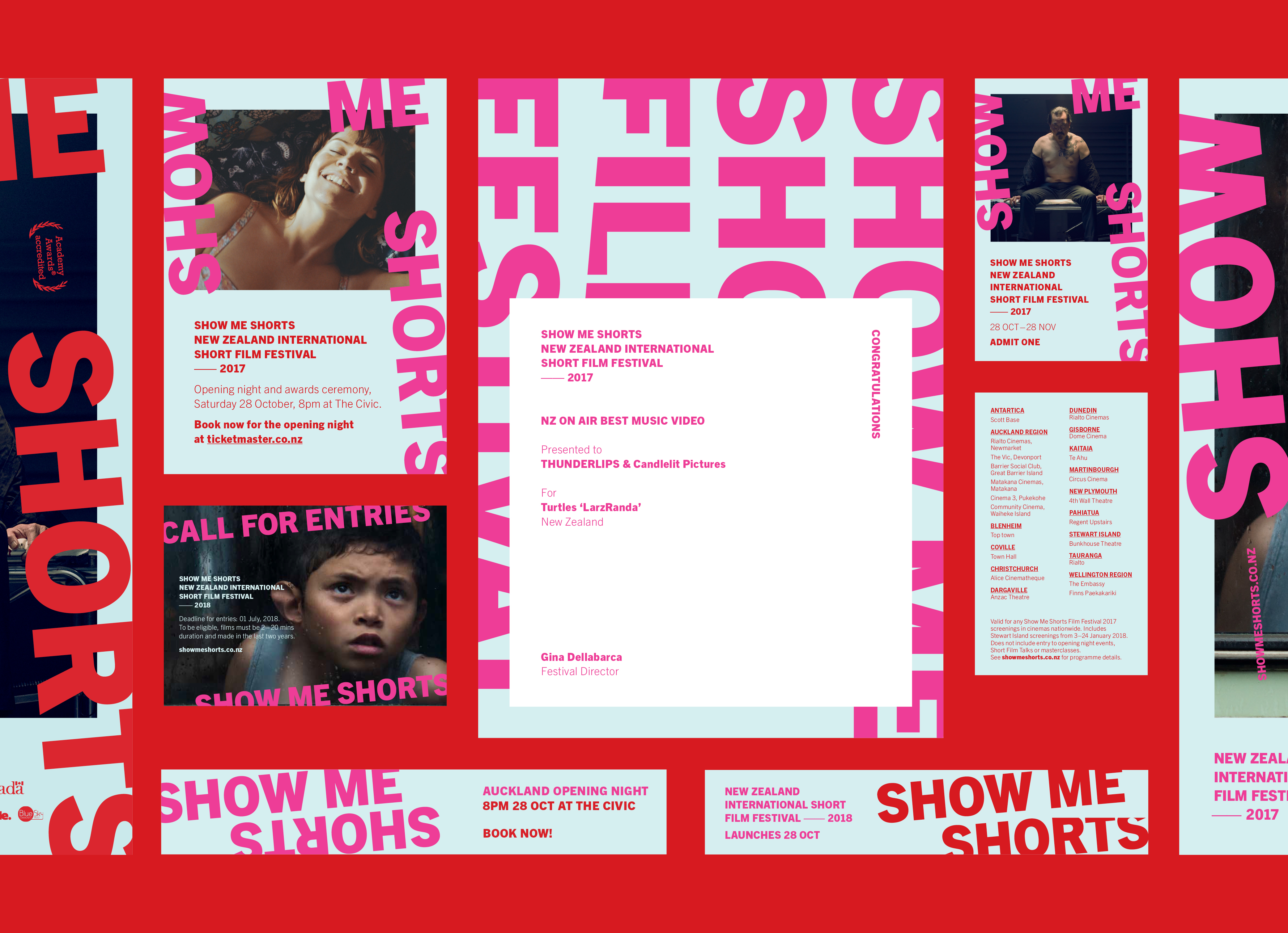
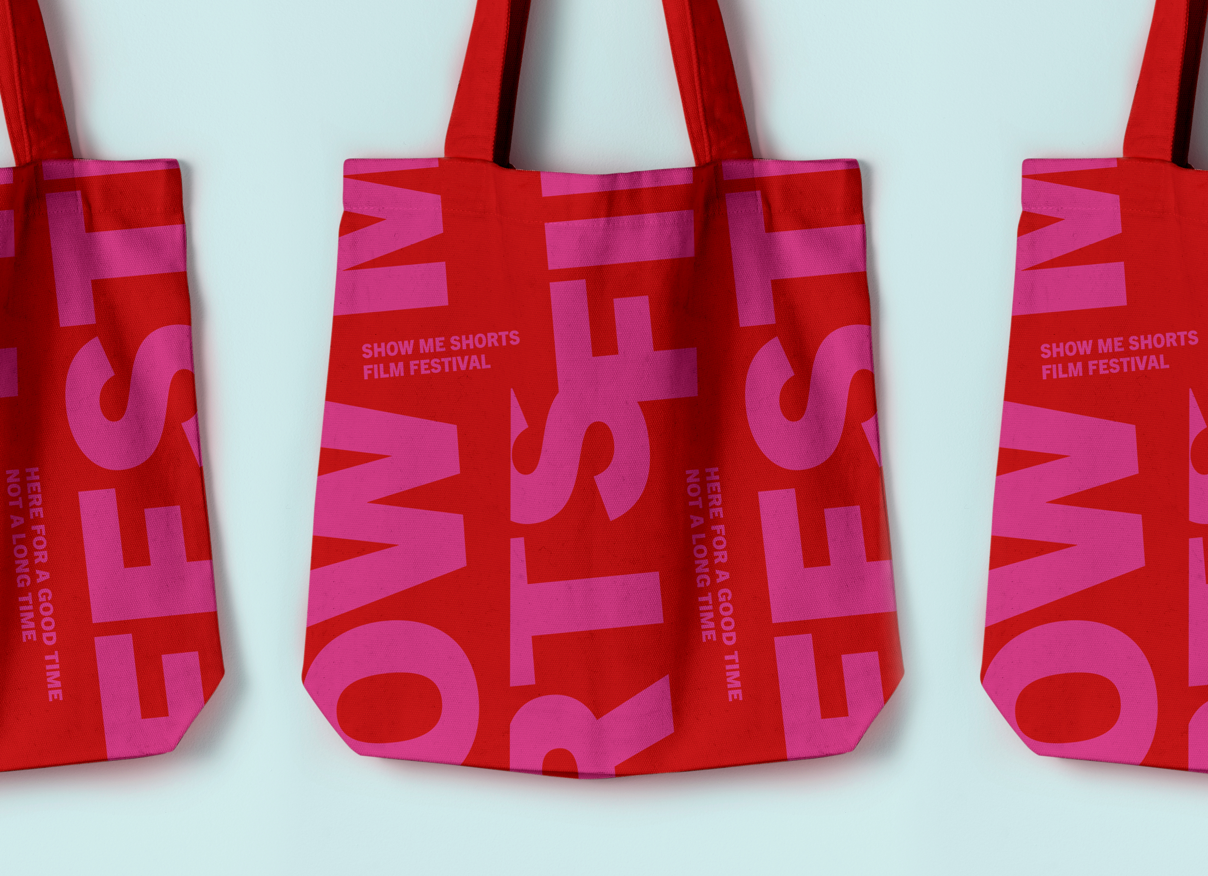
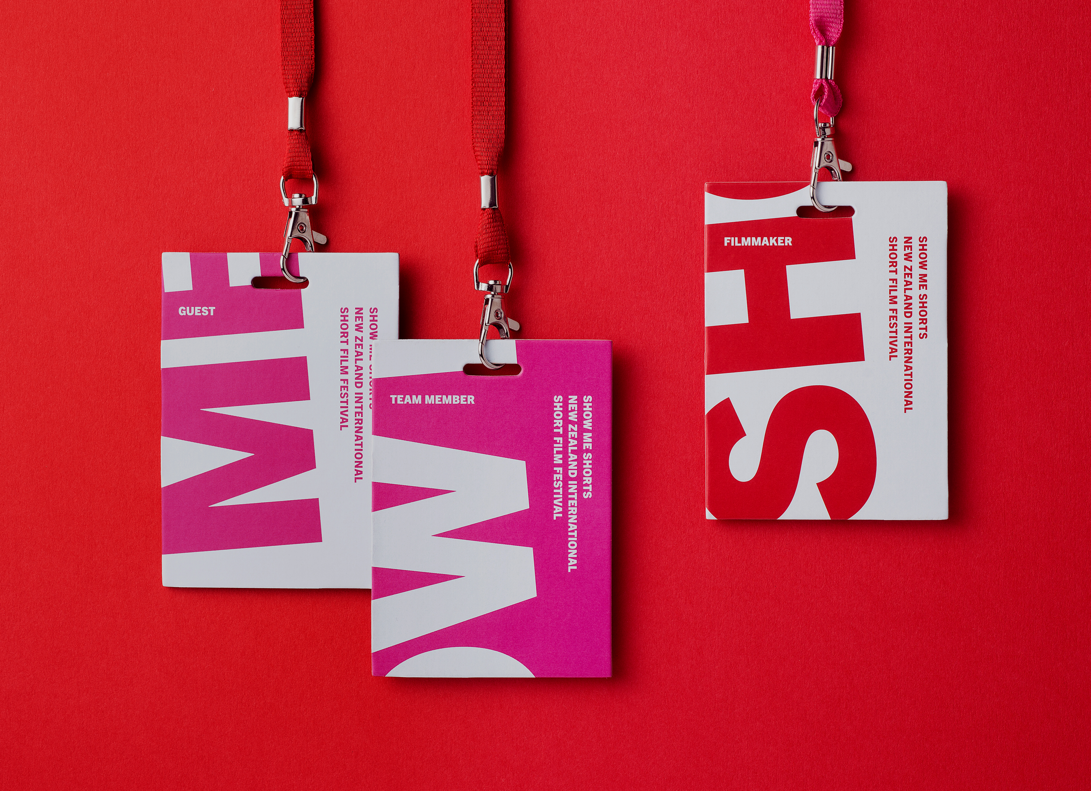
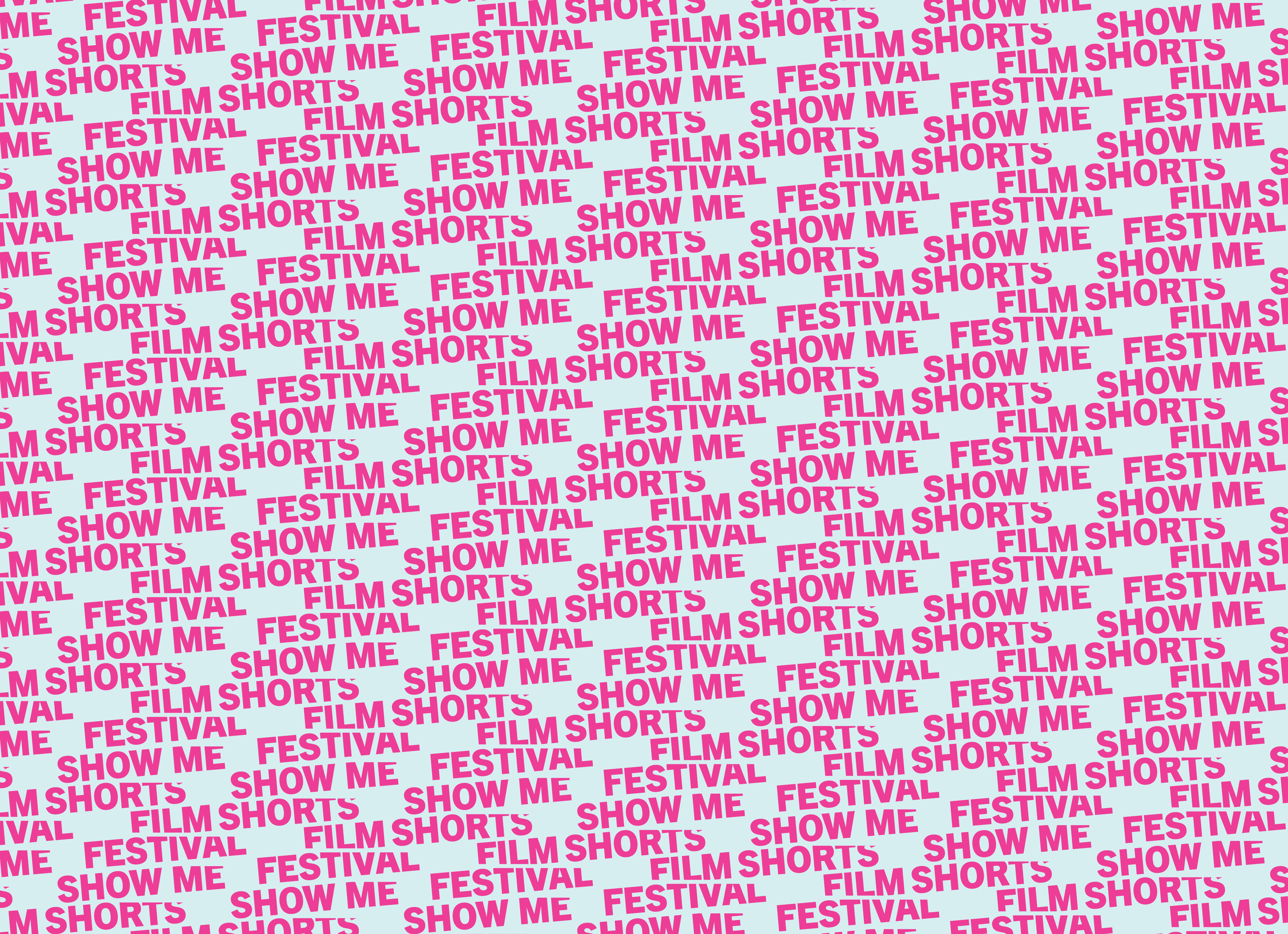
Built from their root strengths, we created a bold, new identity that literally pushes the logo over the edge, disrupting the border and cropping it, with a devil-may-care energy. The campaign (across print, posters, brochure and digital) emphasises the sense of scale, of the uncontainable. It’s a take on the fast-edit, the very vitalness and immediacy of short filmmaking. The colour palette shifted to include a pale blue combined with a pink/red clash, revered for its punk ugliness. There are rules of course. For example, when something is tilted, it is always on a 5º angle. It is a chance to reassure through familiarity and continuity, but to also challenge with moments of unexpected difference. The format affords the festival a degree of storytelling leeway, the opportunity to challenge and push legibility, to be able to catch the eye and demand attention against the endemic cultural preference for simplicity and politeness.
