Gravity Coffee
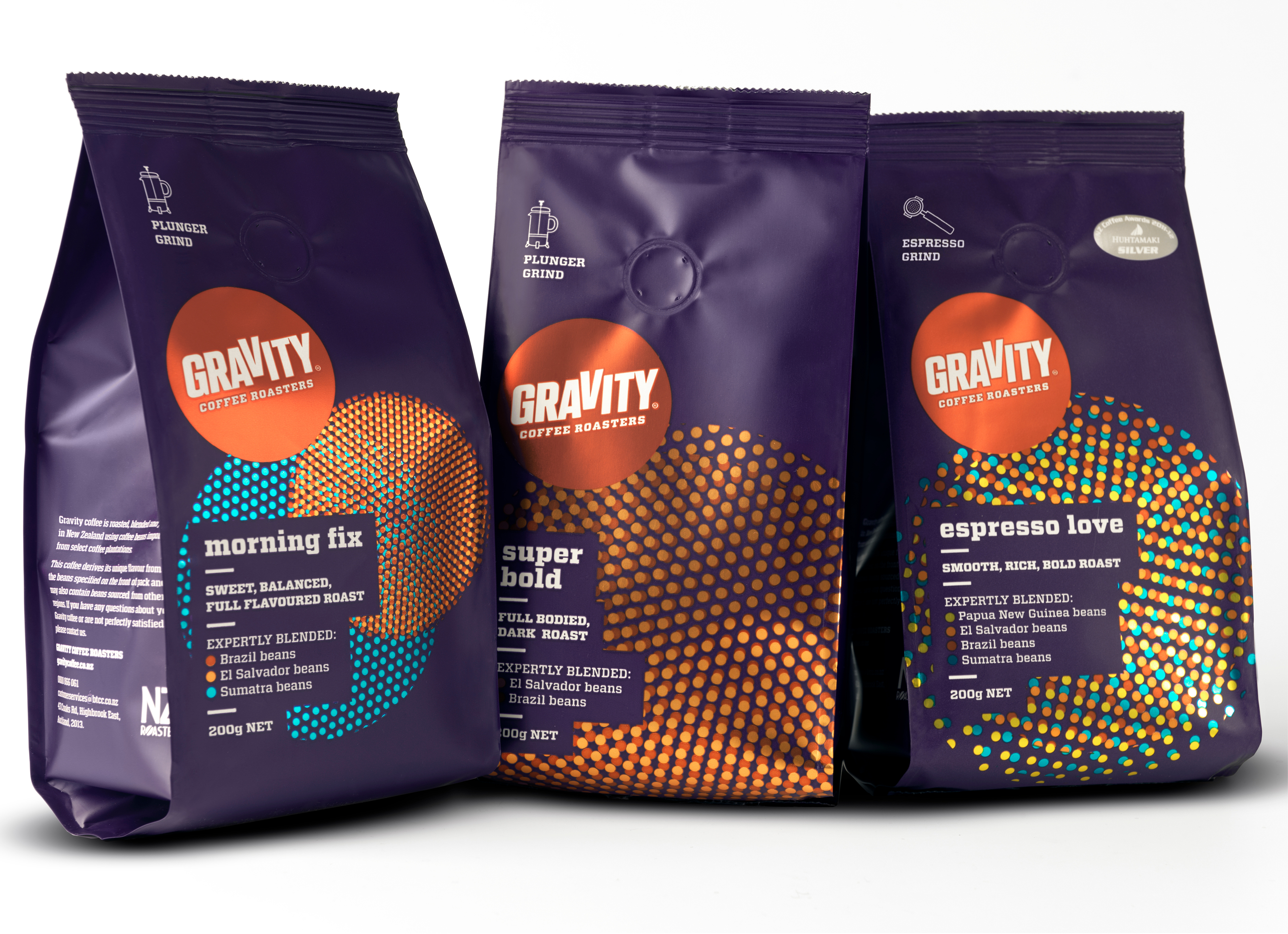
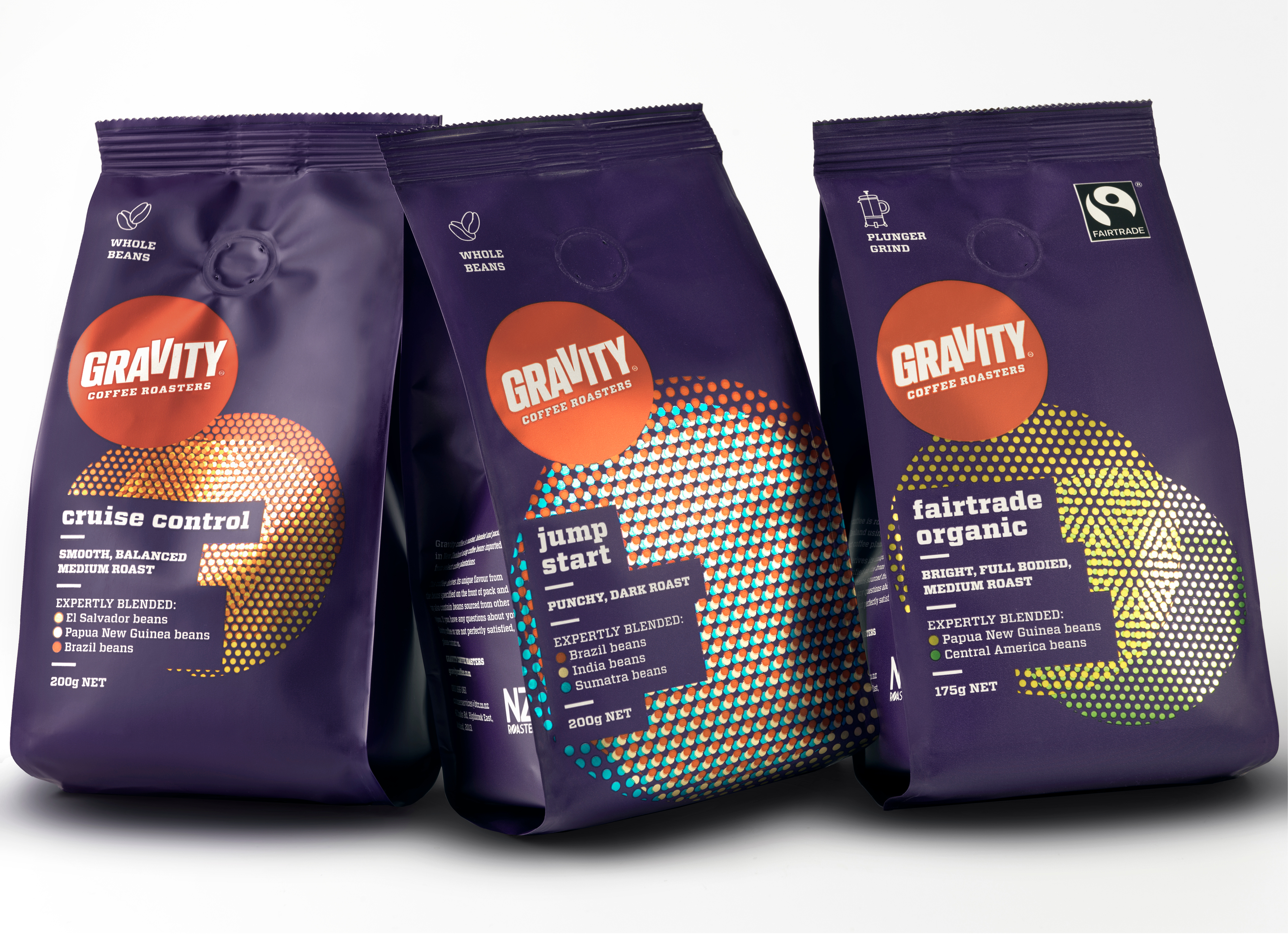
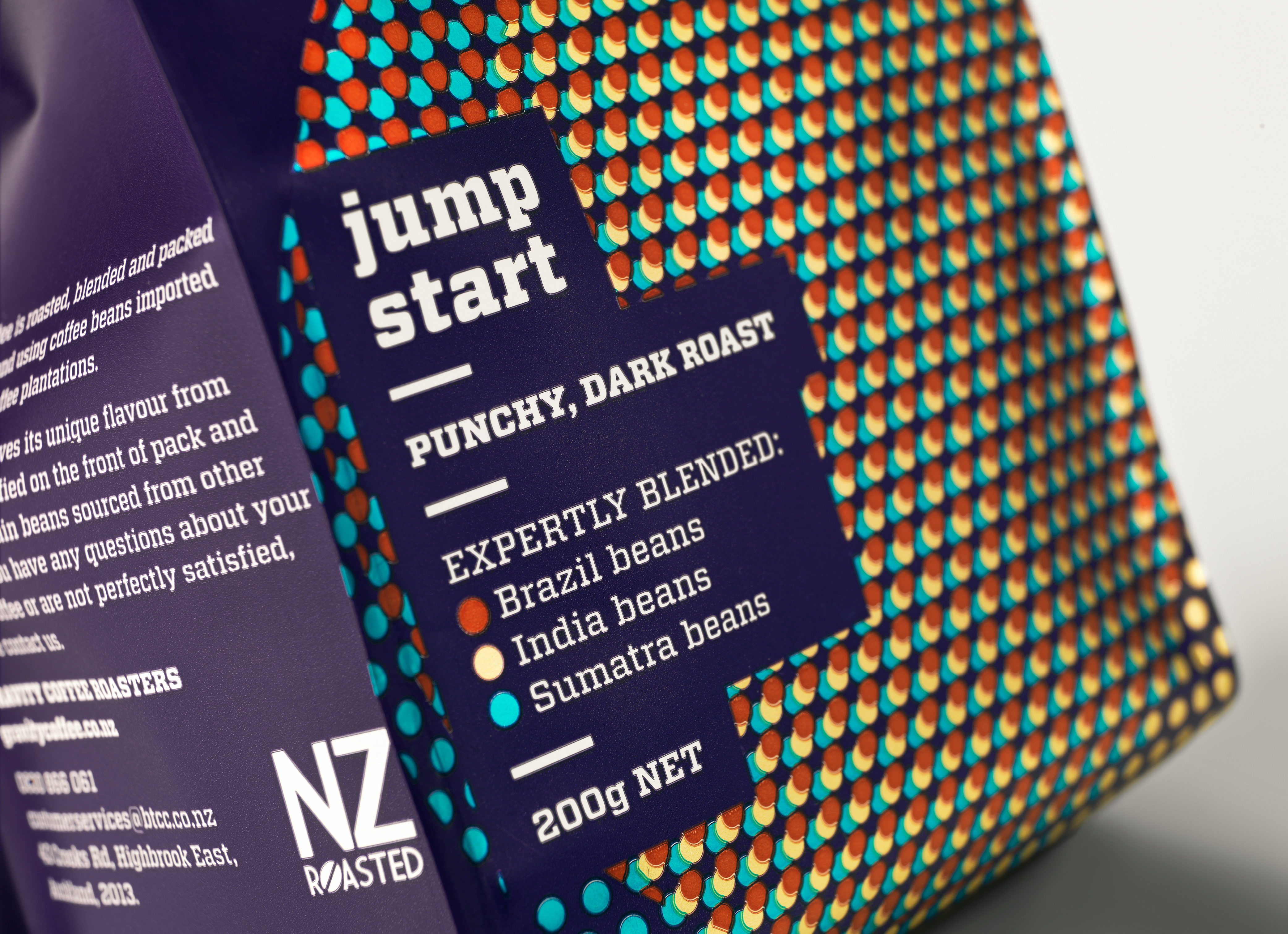
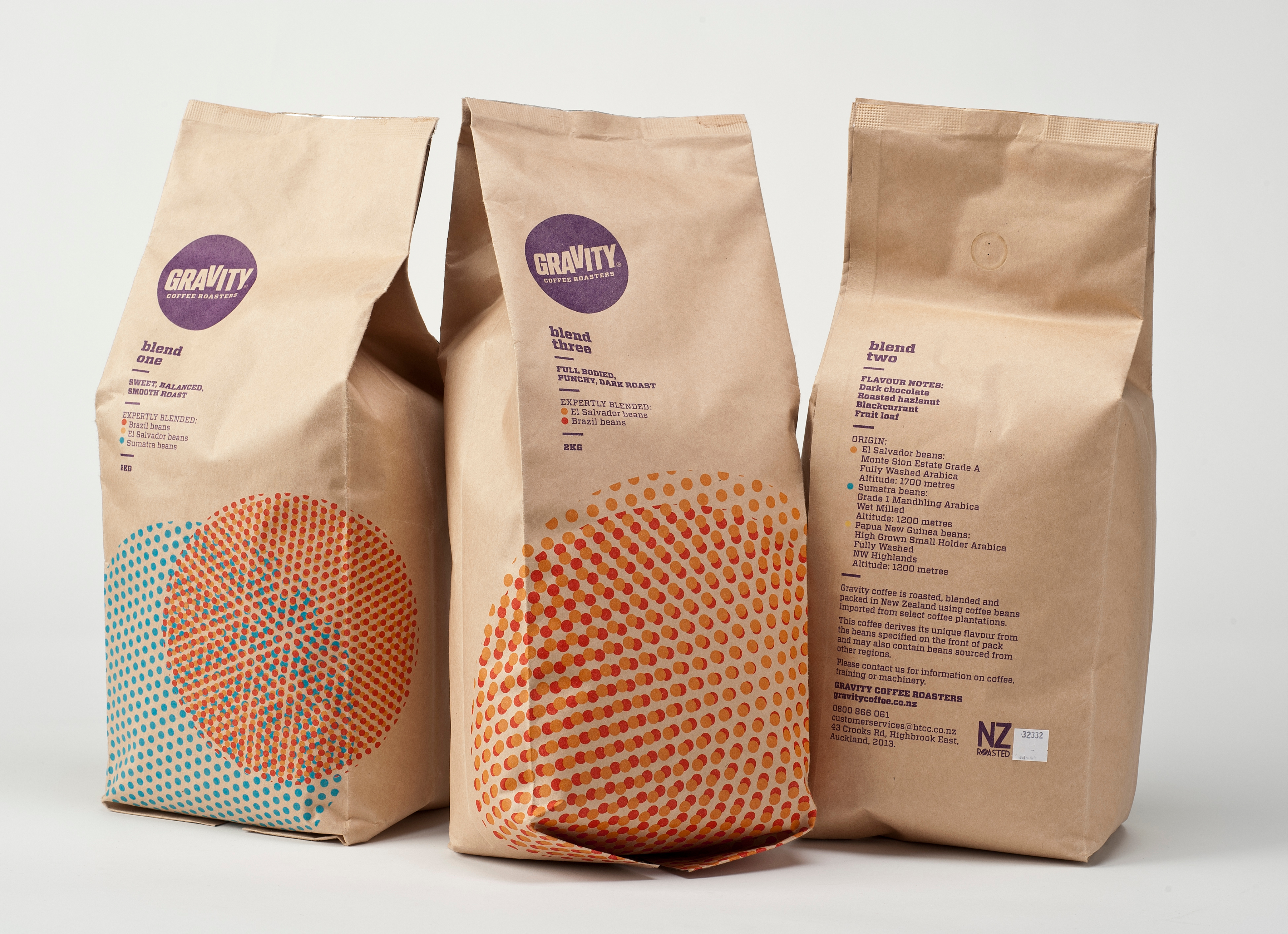
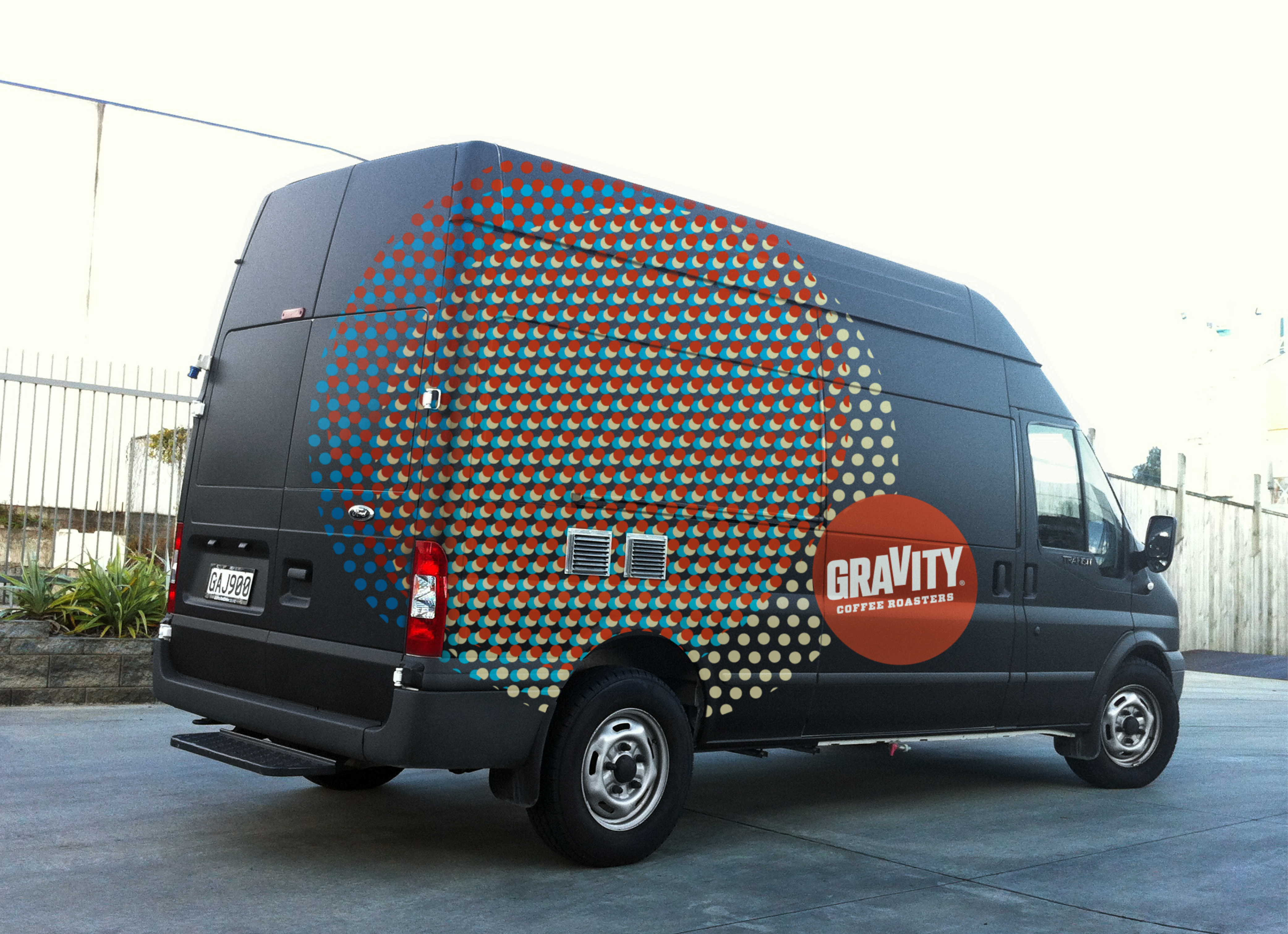
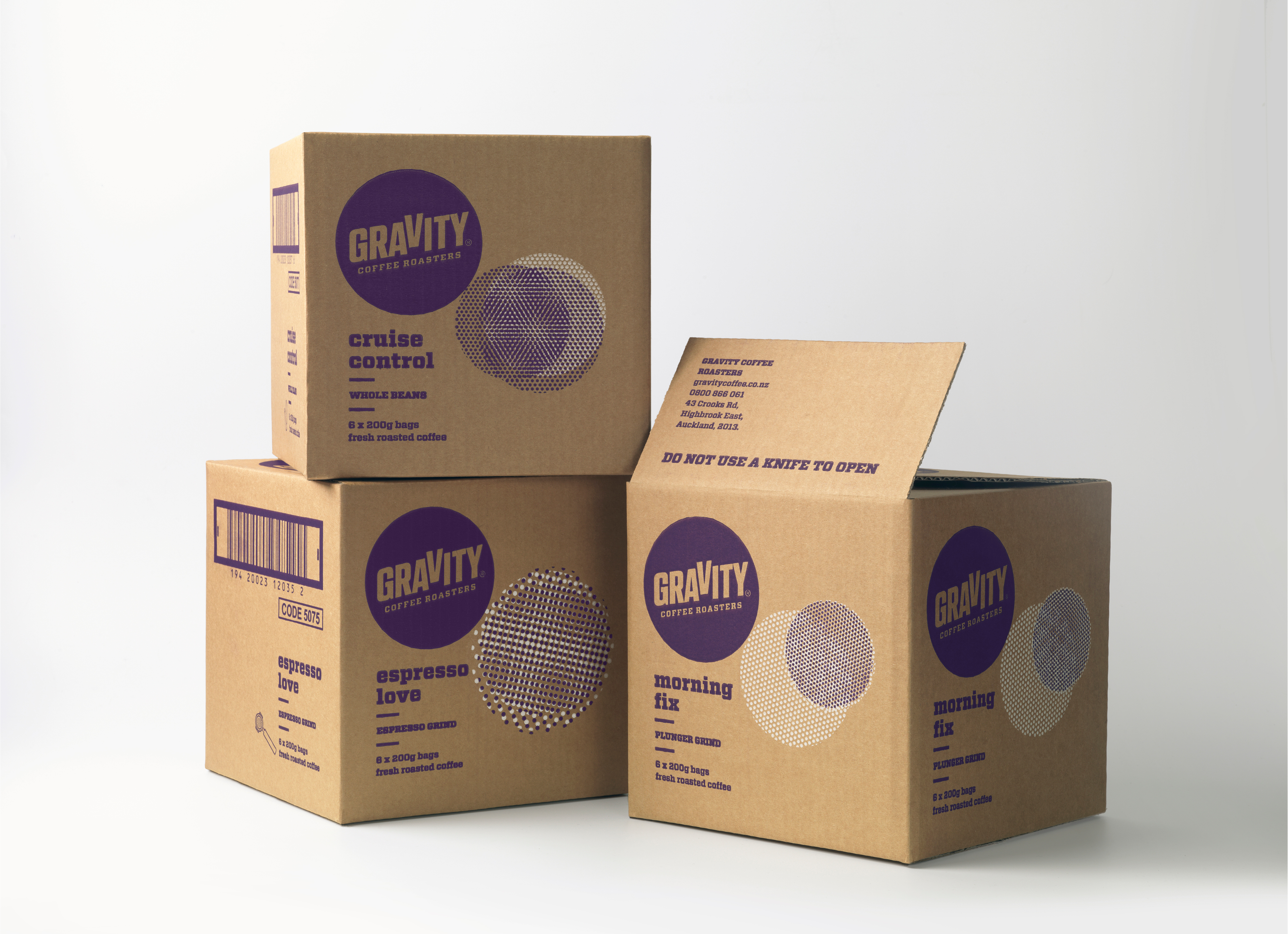
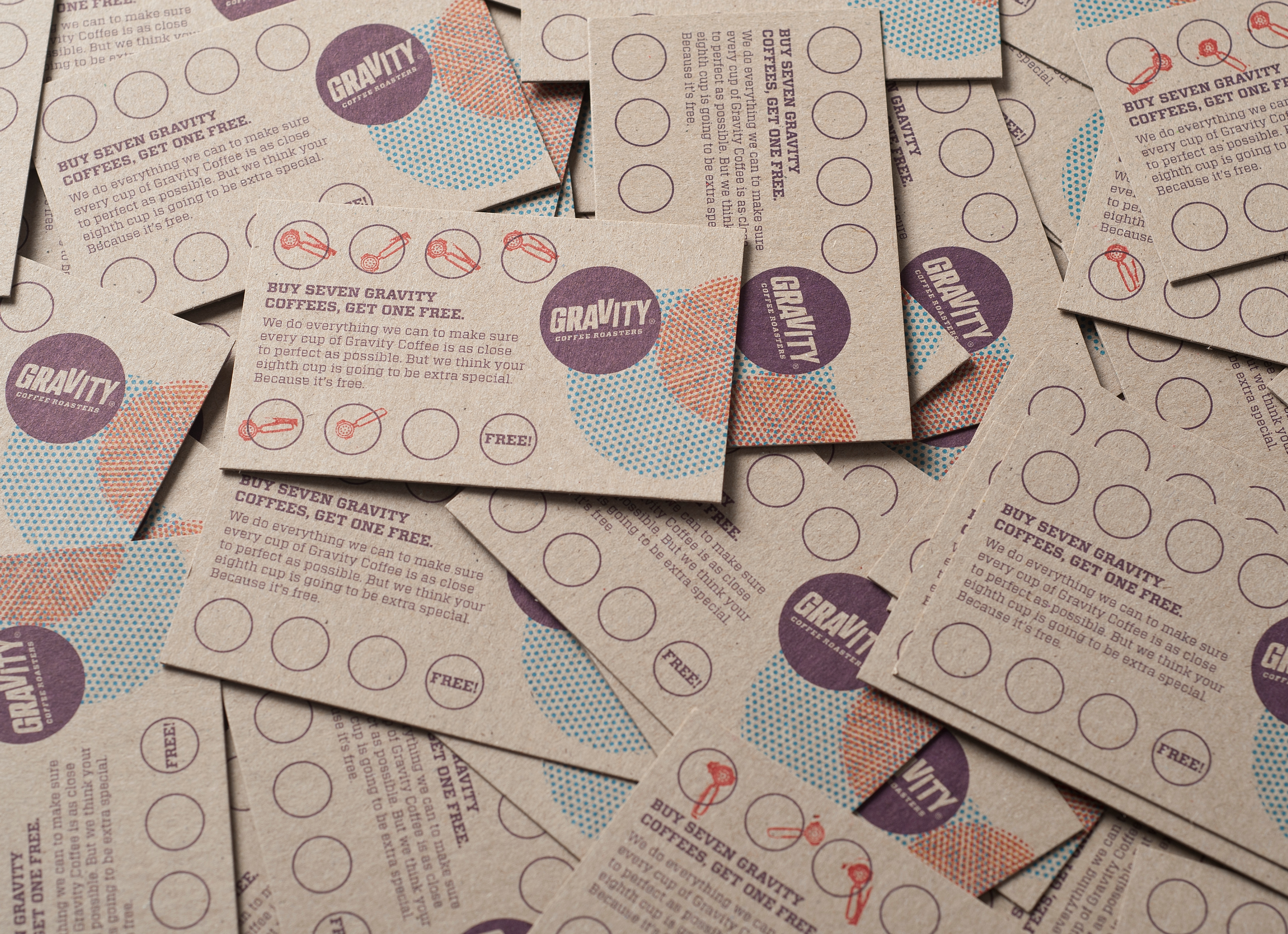
Founded in the early 1990s and positioned to be the young coffee brand with personality, Gravity was beginning to lose respect in the coffee roasting category. We needed to reposition them in a way to demonstrate their coffee expertise and communicate clearly that they are serious about the sourcing, roasting and blending process. We spoke with Gravity’s brew master Stu and fell naturally into discussing flavours through colour, shape and complexity. This informed the basis of our design solution. Abstracting the idea of the coffee filter, we created a dot screen for each origin. We worked with Stu and his team to assign each bean variety a colour that reflected its flavour profile. Bright highlights and deep overtones of flavour were expressed through moire patterns to visually interpret the complex nuances of each blend. The bolder the patterns, the stronger the overall flavour. The result is a brand built around the distinctive approach Gravity takes to roast and blend each of their coffees.
Designed while working at Special Group.
Best Awards 2013: Awarded