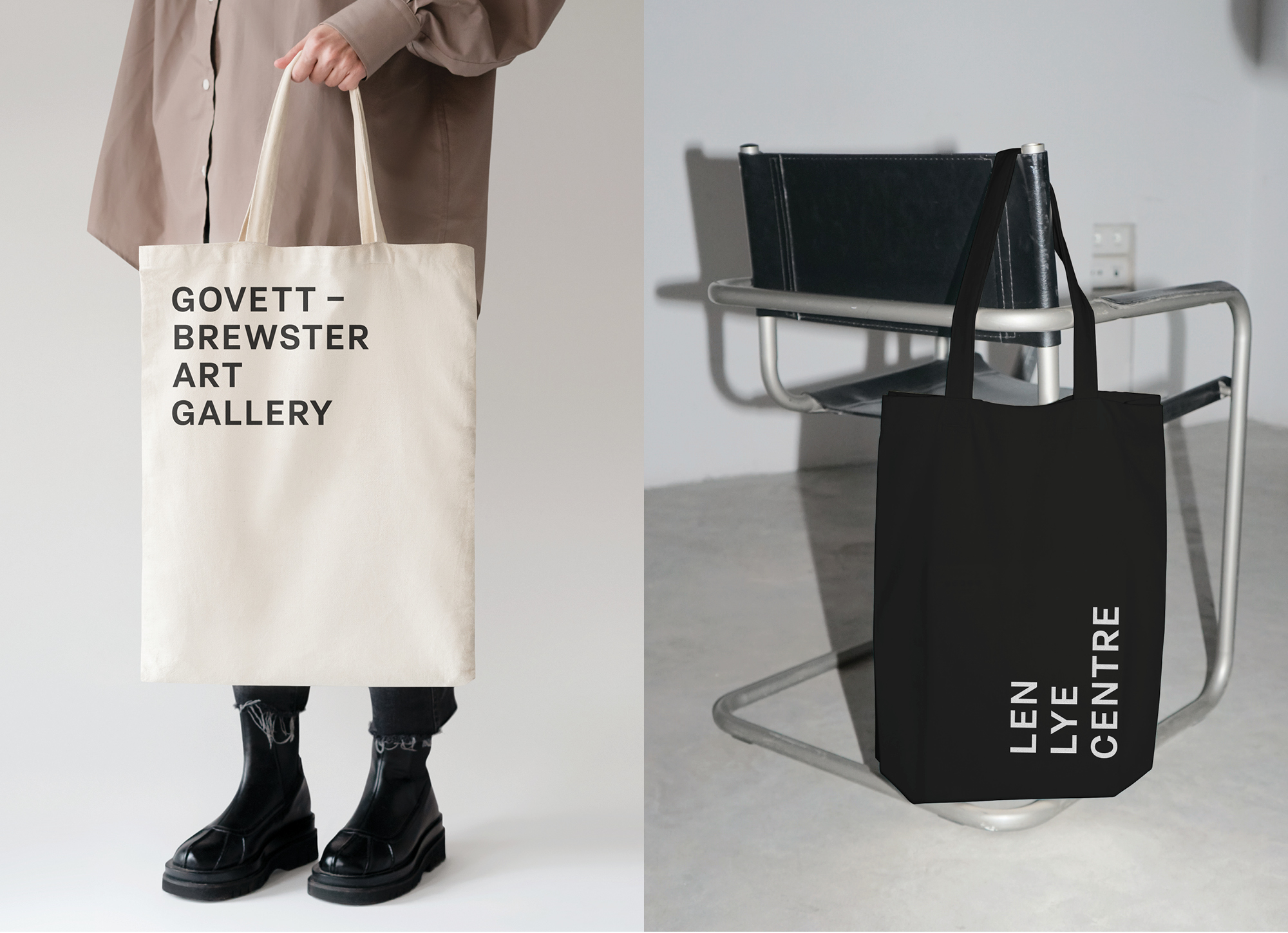
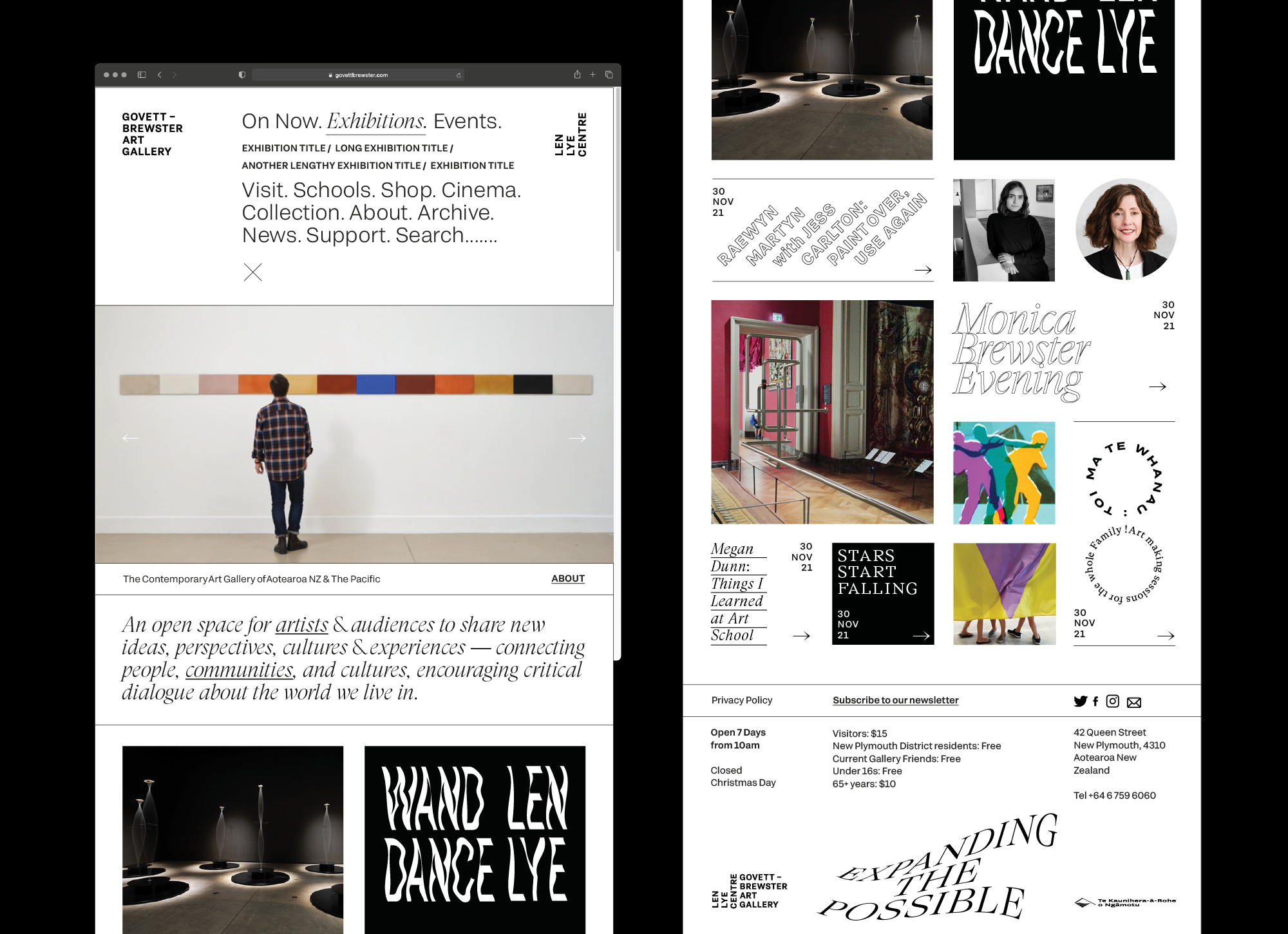
Govett-Brewster Art Gallery
We worked with the Govett-Brewster Art Gallery — recognised as one of New Zealand’s leading contemporary art galleries for championing the diverse voices and practices of artists both locally and internationally — to reinstate their international reputation as a multifaceted institutional brand.
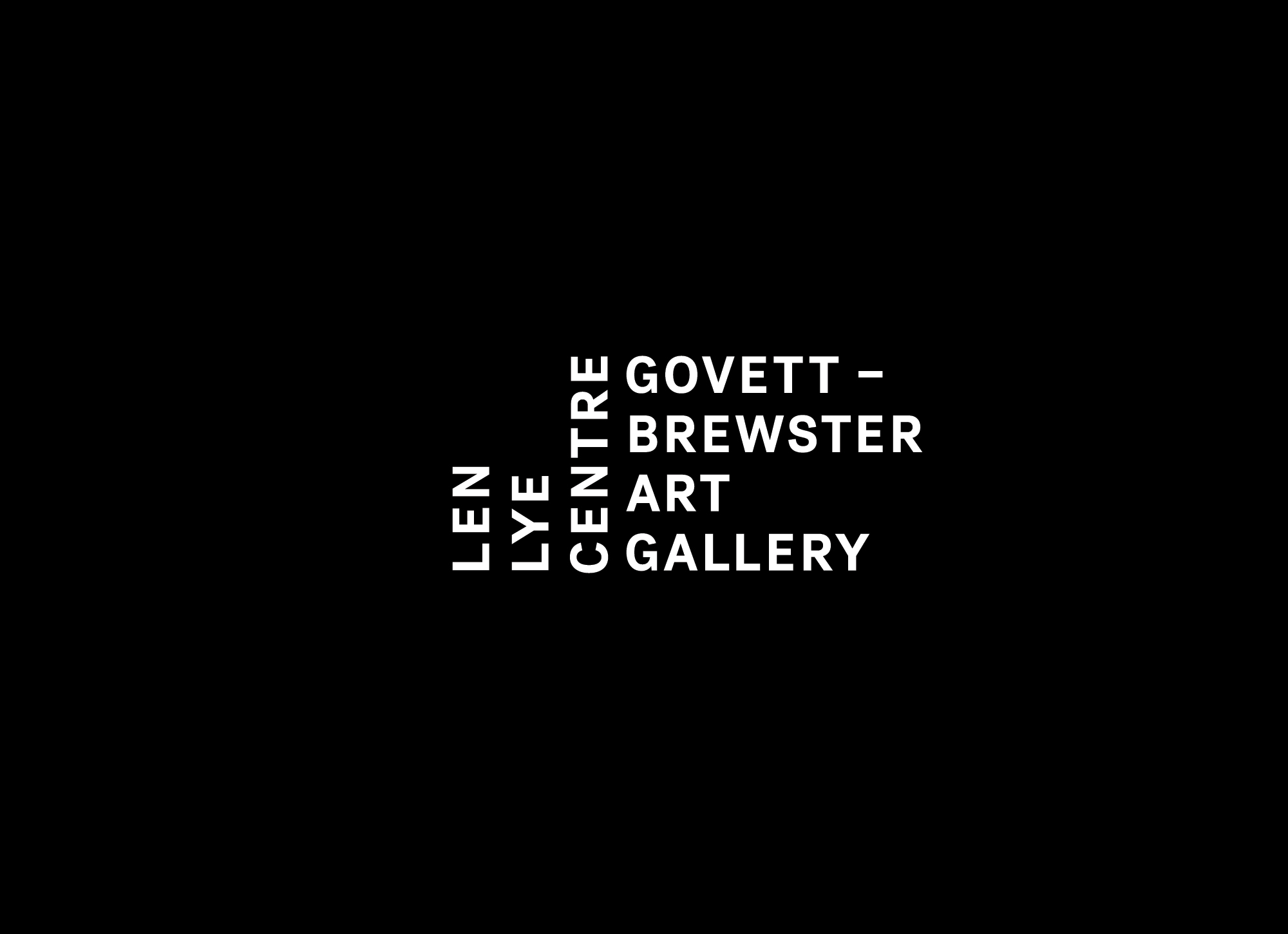
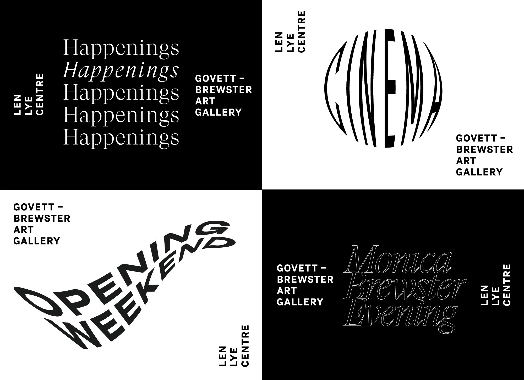
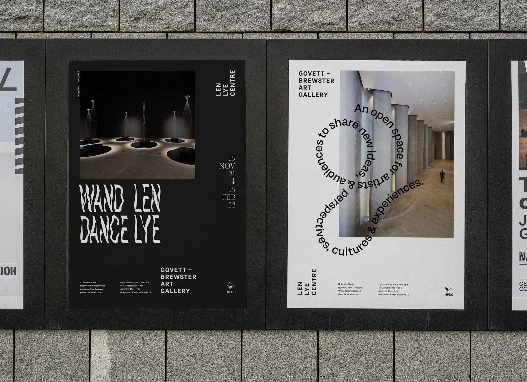
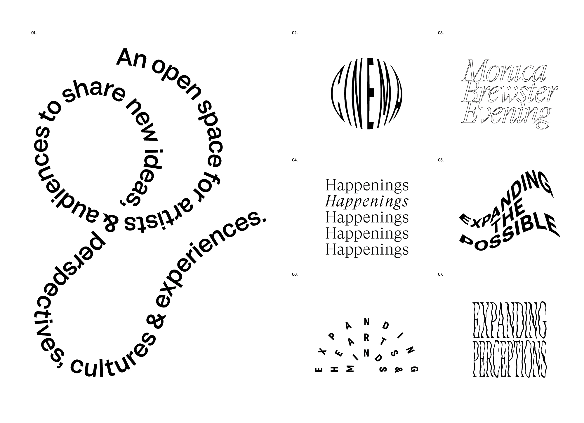
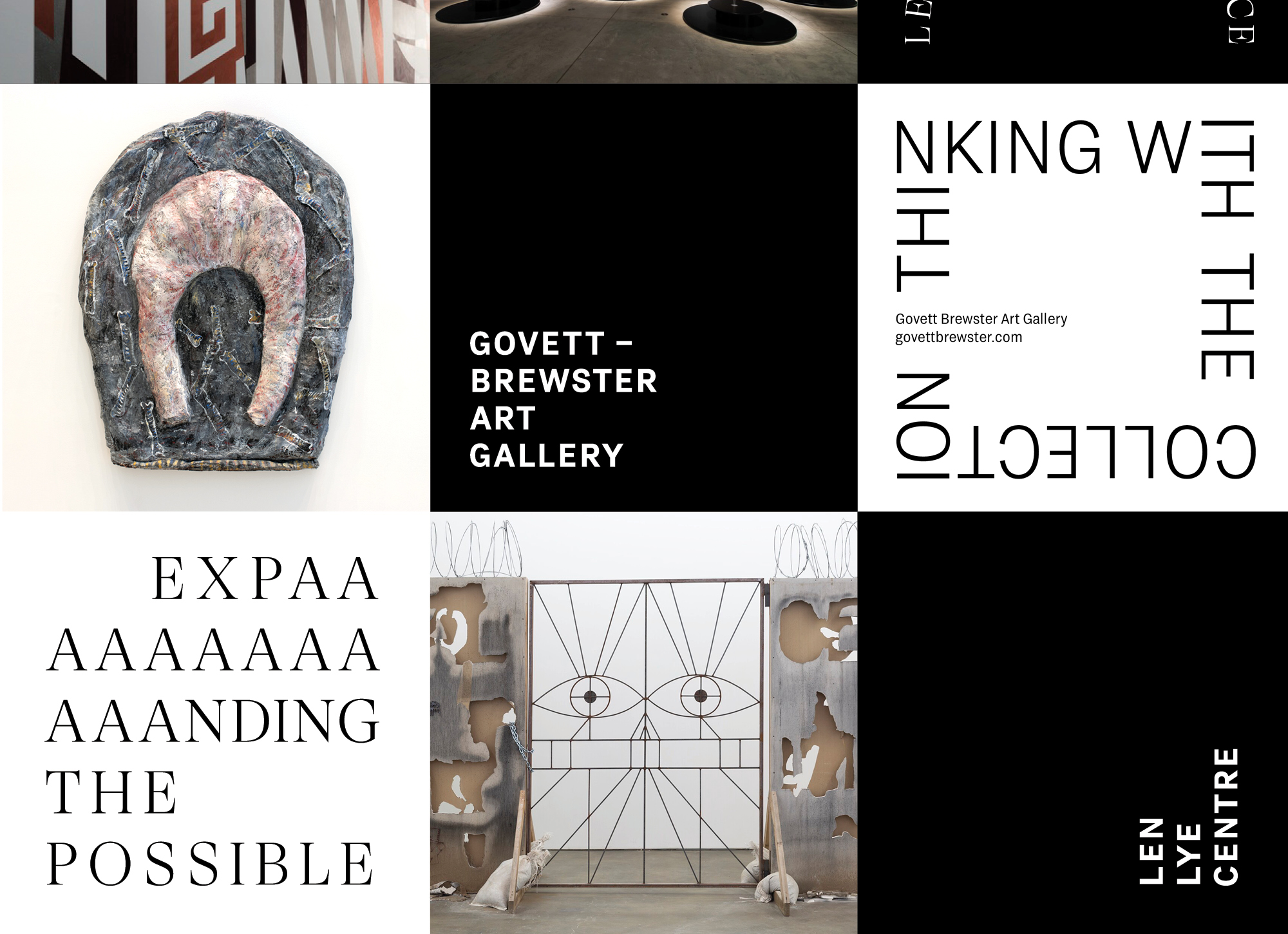
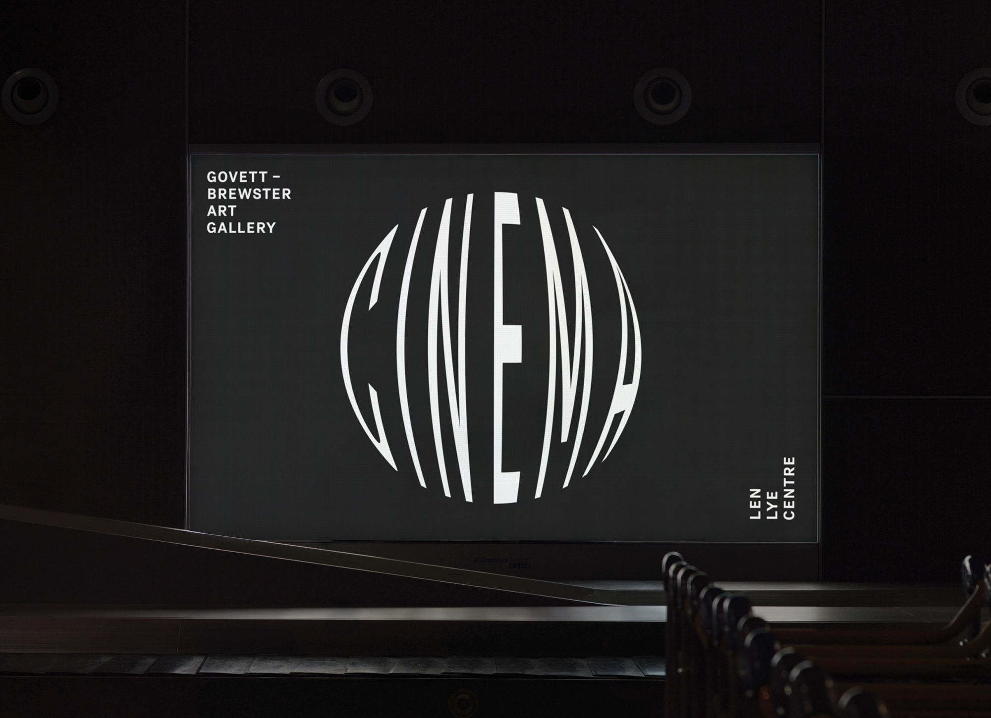
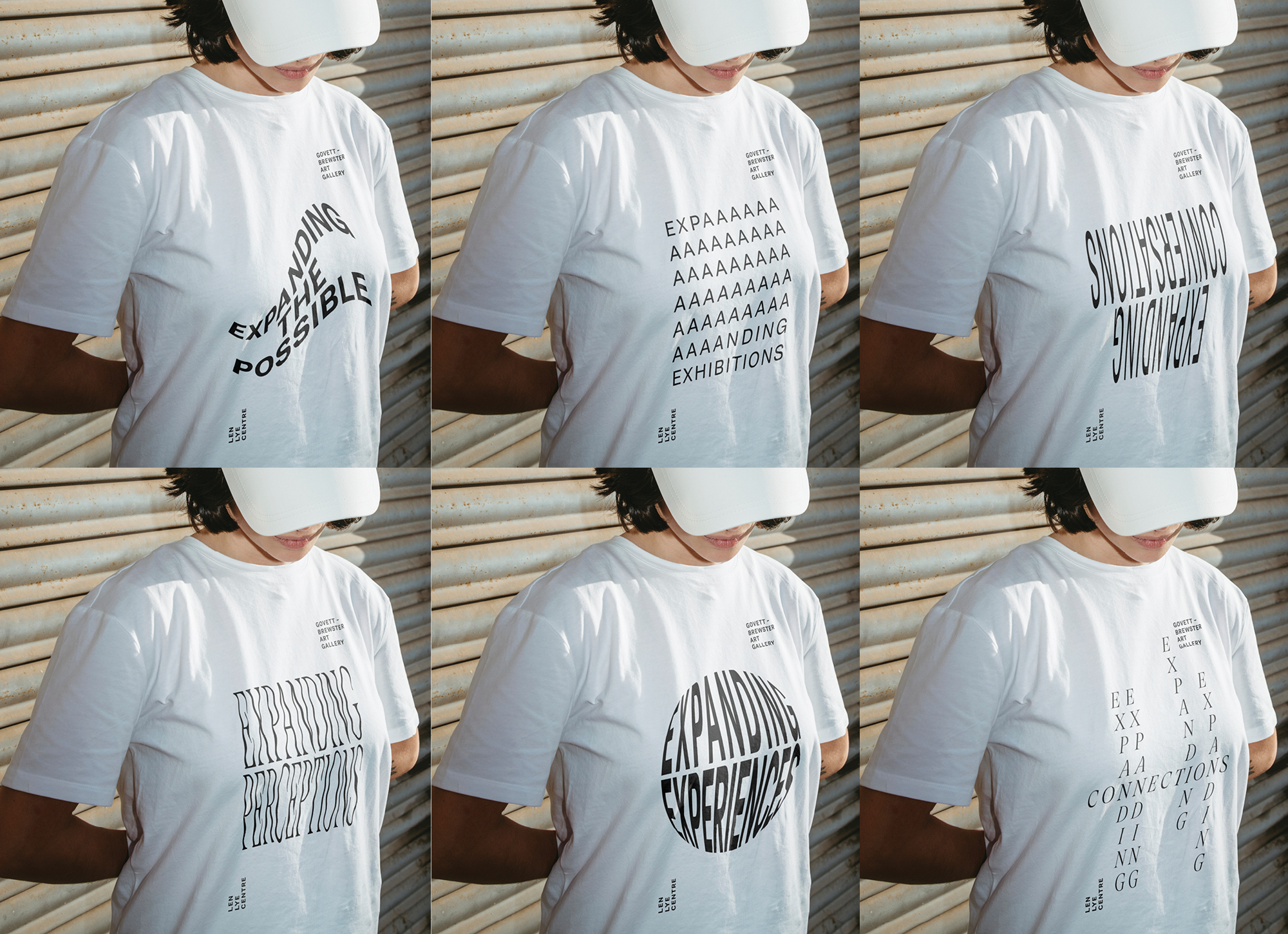
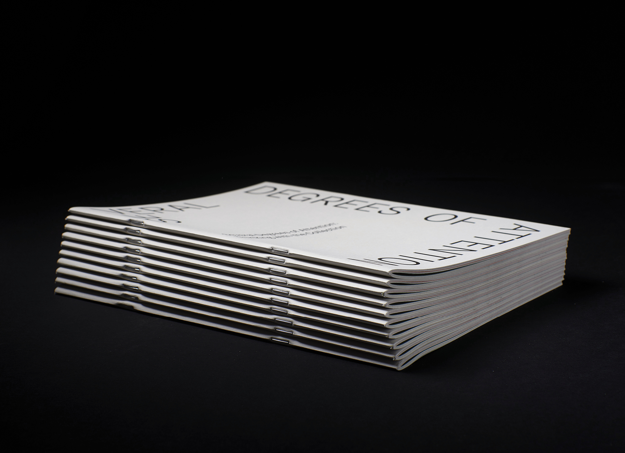
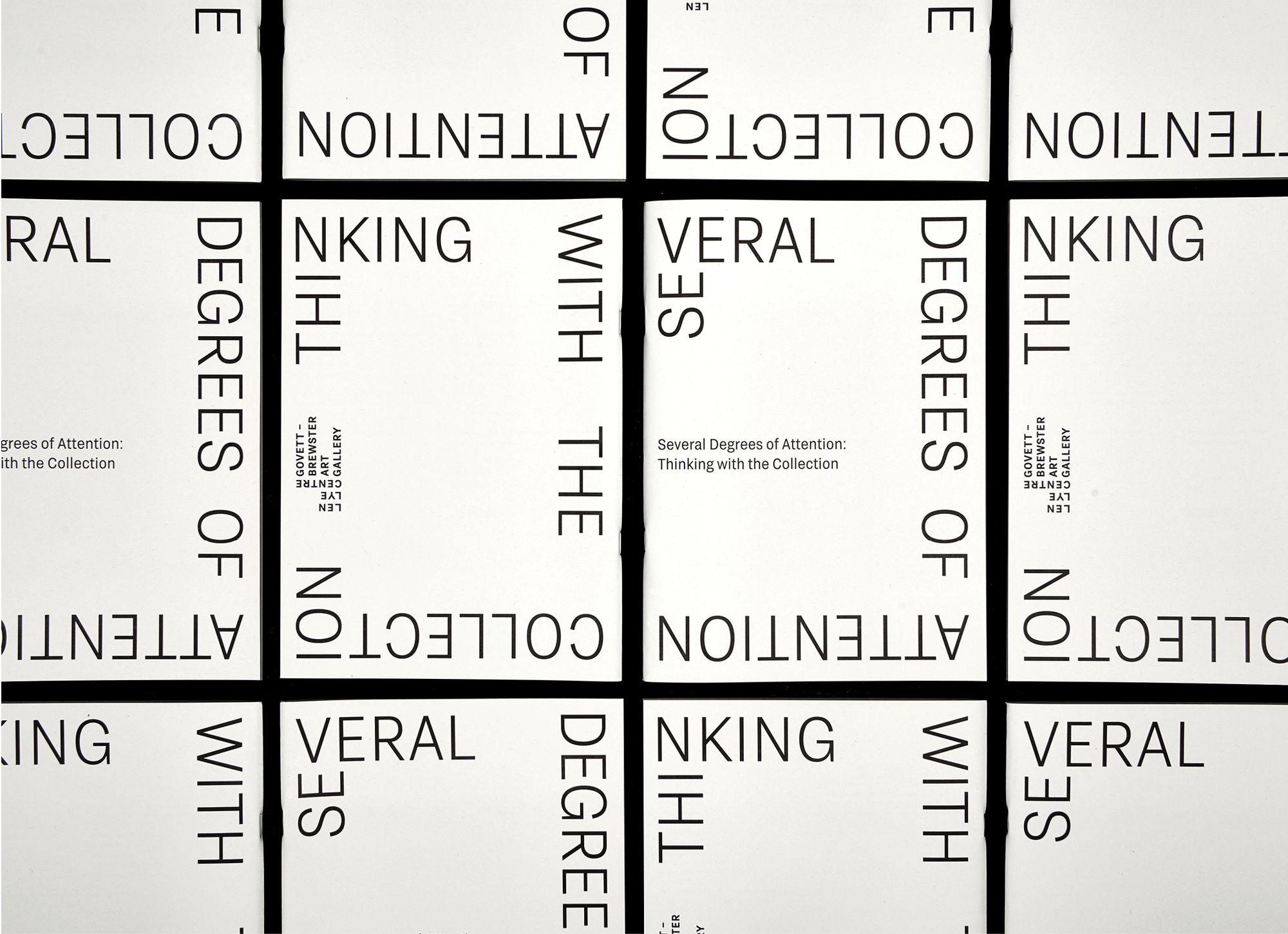
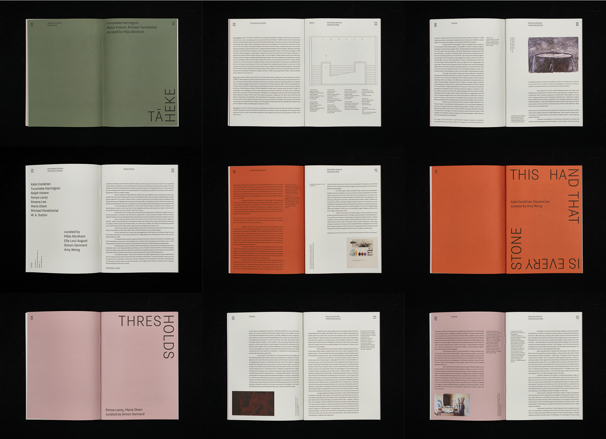
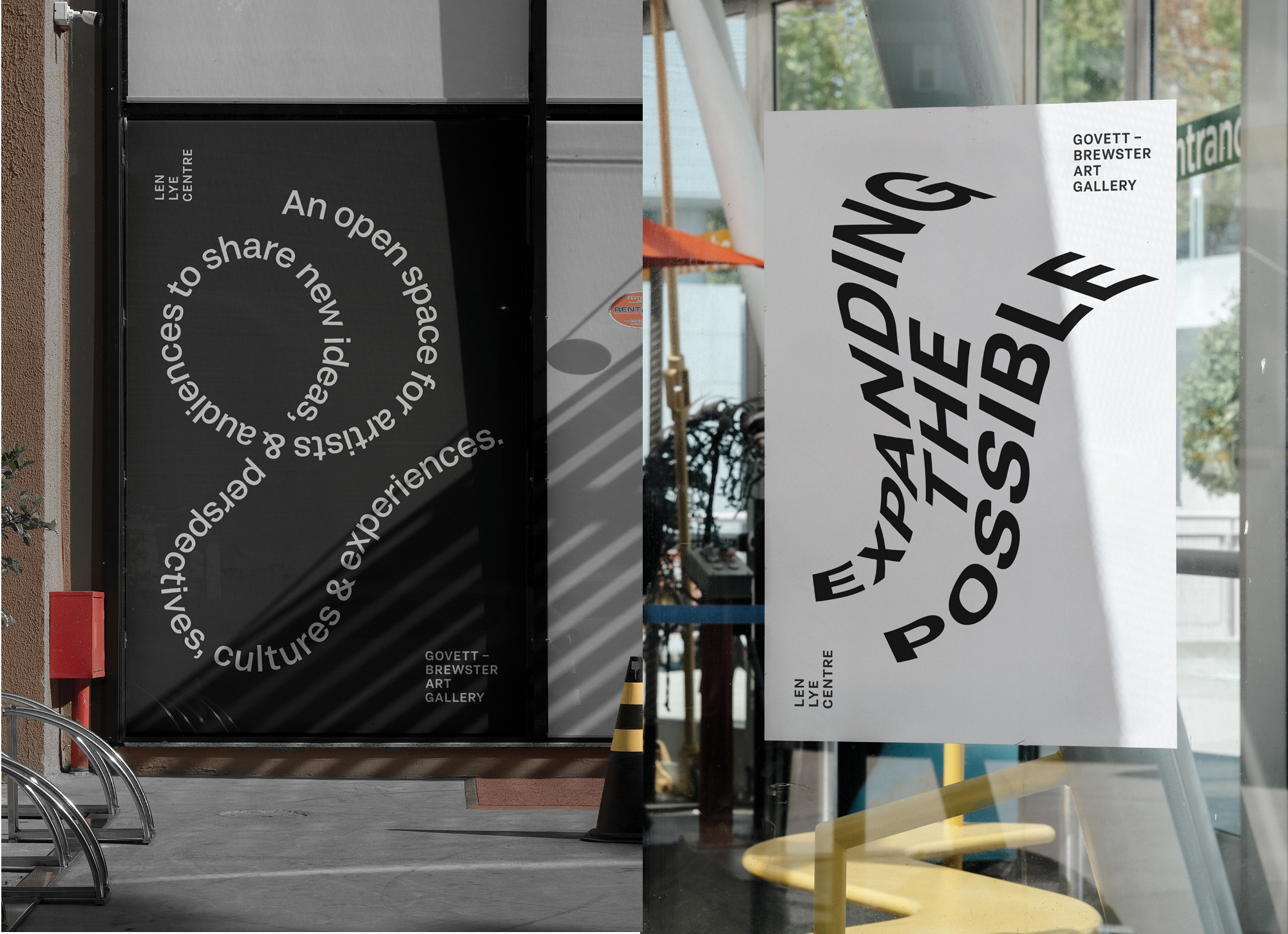
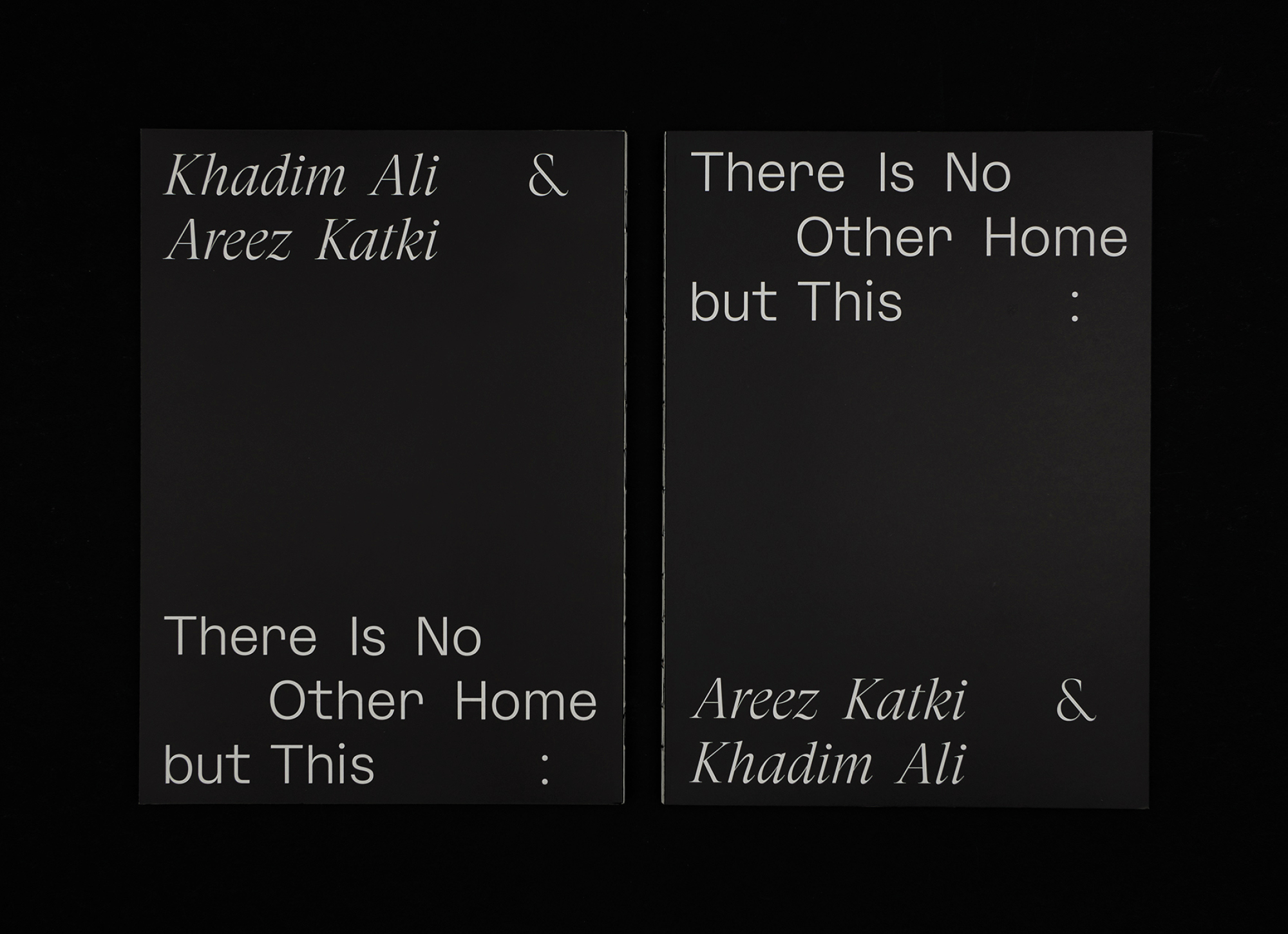
We simplified the logo and let it express the two institutional halves, but in unison, and with the flexibility to move and switch emphasis between the two. We simplified, but simultaneously expanded the identity design system to accommodate diverse practices, voices and happenings. We achieved this by setting some simple principles — such as the gallery is black and white allowing the exhibition programme to bring in colour. As a counter point to a reductive colour palette and strict grid, we expanded through typography. We selected two contrasting, highly variable typefaces to represent the gallery’s polyphonic voices. From there on, there are no rules. Experimentation is encouraged — bend it, pull it, turn it upside down — the aim is to express beyond the alphabetic signifiers.